Sunday, December 29, 2013

Roots

©Will Nelson

I learned to paint in watercolor as if it were the family business. My grandfather, Will Nelson, is a painter, illustrator, and teacher. My uncle Roland Giampaoli, has had a similar career. I have very fond memories of my grandfather's art studio. I recall thumbing through books of paintings and drawings, the smell of linseed oil and turpentine, and the piles of sketches, books, and art supplies that made it seem such a chaotically creative place. When I was in middle school I started taking watercolor classes from at my uncle Roland's Paint and Draw Art School. I would draw and copy watercolors painted by my uncle or by Gaye Hoopes. This is a way of learning art that isn't practiced much anymore, accept at a few Atelier schools around the country. It was a tradition practiced in the early academies in Paris, Rome, and London. The idea was that a student would absorb compositional, technical, and narrative techniques from exposure to the best work. At its best, the academic tradition produced some great painters such as GericaultCouture, and Picasso. At its worst, the work was derivative and forgettable. Browse the list of the winner of the Prix de Rome (the top academic accolade from the premier academy) from 1860 to 1890 and you'll encounter nothing remarkable--at a time when art was changing in leaps and bounds. Truly innovative painters, such as Manet or Degas, never achieved the Rome Prize. Goya (although he later became the academy's director) was initially refused admittance into the Real Academia de Bellas Artes de San Fernando.

But that's not to say there isn't a lot to be learned from studying the past. The serious student, I think, can learn a lot from copying. I'm not sure if I was quite there at the age of 13, but I still remember laying in those washes and trying to get my head around painting a tree is 3-4 brush strokes. My arm and hand still remember the movements and feel of the brush, so I must have picked up something. These experiences are most telling in the way I paint. Others besides myself have noticed that my painting process is more like my uncle Roland's, in that it's pretty loose and energetic. The end result however, is more like my grandfather's.


Saturday, December 21, 2013

Christmas at Kahnawake

With Christmas just around the corner, Katria challenged me to write about the holiday as St. Kateri would have know it.

Christmas in the 17th century was a controversial subject. To British and American protestants, the holiday was seen as mildly "papish" or at worst, a pagan holdover with echos of solstice bonfires and Asiatic tree worship. It wasn't really until Dickens popularized the holiday in A Christmas Carol and the Germanic Queen of the United Kingdom, Alexandrina Victoria of Saxe-Coburg-Saalfeld, and her consort, Prince Albert of Saxe-Coburg-und-Gotha, erected their own Christmas tree, that the Protestants warmed to the practice.

The Dutch, being accustomed to a multicultural (that is, composed of catholic and protestant elements) society, were known to celebrate the holiday in their colonies in the Americas. Although, for them, the festivities usually occurred around the feast of St. Nicholas--or Sinterklaus--in early December. Anyone who is familiar with the writings of David Sedaris will know that this is still the Dutch custom. Some aspects of their December festivities are generating controversy today.

Catholicism has a rich history in Canada and the French Catholics in Quebec were more inclined to celebrate the Nativity of the Lord on December 25th in greater splendor than the adjacent feast days. "Christmas" is a contraction of Christ's Mass in old and middle english. The OED first records it in 1038 as Crīstesmæsse. So you won't find that word in any of the non-english primary sources. In Quebec the holiday was referred to as Noël. While I don't have specific details about any Noël celebrations during the time St. Kateri was at Kahnawake, I have been able to dig up a record of Christmas celebrations involving Jesuit missionaries, French settlers, and the Plains tribes of present day Michigan.

Histoire des Canadiens du Michigan et du comté d'Essex, Ontario
For those of you who don't parler français, here is a paraphrase of the relevant passages:

In 1675 Father Pierre Bailloquet came to the mouth of the Saginaw River, where he built a chapel--the first built by Christians in lower Michigan--where he celebrated the feast of Noël in splendor. "Having a small crib next to our altar," he said, "our christians came at midnight and during the day. They caused these forests to resound with their hymns in honor of the newborn Jesus . What a joy for us, at the midnight mass and during the day, to see the child Jesus recognized by the Indians in this country" 

Being a dutch and german invention, Santa Claus was absent, as was the exchange of gifts. While their celebration was much simpler than what we know today, there are many similarities. We know that they celebrated with hymns and songs, and decorated the chapel with a rudimentary nativity scene. They even held a midnight vigil mass, although the lack of reliable clocks may have made timing less than exact.

Regarding the hymns they sang, I haven't had much luck in locating a Jesuit missionary hymnal from North America. They must exist, since the jesuits travelled with books of homilies and prayers in phonetic transcriptions of the languages of the Native Americans. Since I don't speak french, research is cumbersome as I translate terms back and form. I do have a one hymn to share with you, written circa 1641 by the missionary Jaques Brebeuf at Sainte-Marie-au-Pays-des-Hurons in Ontario. It is now known as 'Twas the Moon of Wintertime, but in the original Huron it was known as Jesous Ahatonhia (Jesus he is Risen). The song has the distinction of being the first North American Carol. Bruce Cockburn recorded a version of the song in Huron. List to it here

It is difficult to know what hymns they would have sang at Kahnawake, but since the community included Mohawk and Huron, this song will at least convey the sound of the language that may have been heard at their celebrations. Merry Christmas.


Monday, December 16, 2013

Head Study no. 7 and 9


Since we took so many shots at the photoshoot, I've had a lot of work to do in sorting through them all. So far I've gathered about a dozen that contain information useful to making the painting. Even still, there are a number of issues that are better worked out in paint. Questions like "How am I going to simplify the hair?" or, "What if I adjust her gaze downward?" are easier to resolve by taking a day to make a small painting. This way I have some idea of what I'm getting into when I begin the large canvas. Last week I painted a few studies of Lauren, Jadalyn, Tyler, and the longhouse interior. Below you can see some photographs of the progress on the 7th study I've painted of Lauren so far.

An article about me appeared in the Evangelist journal of the Diocese of Albany. Check it out here:
Siena Artist Paints St. Kateri Tekakwitha


Friday, December 13, 2013

Figure Study


I began a scaled study of the entire painting on Tuesday. The anticipated complexity of orchestrating a multi-figure composition has made me anxious to get some visual confirmation that I'm on the right track. It's been pretty successful. Only some small changes are needed in the beams of the building to better reflect the scale of the space. The image above was taken from a small study of Tyler that I've also been busy painting.

Monday, December 9, 2013

Photoshoot

© Katria Foster Photography

The other day I gathered everyone together on the Siena college campus for a group photoshoot for the second painting. The goal was to get enough visual information for me to get started. Since two of my models were traveling from the other side of the state I wanted to make it count. We all worked hard and Katria took some great shots that I'll rely on the make the second painting. I'm excited to soon begin painting Jadalyn and Tyler.

© Katria Foster Photography

Tuesday, December 3, 2013

French Fashion Part II


Male Iroquois dress traditionally consisted of pieces similar to female clothing, but in a much more minimal fashion. The drawing above, made in the late 17th- or early 18th-century depicts two men in the lower left corner.  Leggings, Moccasins, and a Skirt or Loin Cloth covered the lower limbs. The torso was most often bare. When an upper garment was worn, it took the form of sashes, blankets, or other loose drapery. Despite the matriarchal nature of Iroquois society, the patriarchal conventions of European business and diplomacy meant that male members of the tribes and clans would deal with the English, French, and Dutch. Rather than dress in an entirely European manner, they would adopt garments that could be altered to suit their own uses and aesthetics. In Verelst's early 18th-century painting of a dignitary from the Turtle Clan, the gentleman wears European garments that have been refashioned to reflect Iroquois convention.


In Kahnawake the Mohawk and the Huron lived with greater exposure to European culture. They were able to trade for a greater variety of material. Since the Iroquois in Chauchetiere's drawings are depicted in European garments, that has been my strategy with the second painting. St. Kateri Tekakwitha and a young girl will be clothed in material similar to what is worn by St. Kateri in Chauchetiere's portrait. The young boy will wear a loose, belted shirt and leggings.

Wednesday, November 27, 2013

French Fashion


One of the most tangible differences between life on the St. Lawrence, and life along the Mohawk would have been the greater access to European trade goods. The proximity to Montreal and Quebec city meant that the community at Kahnawake would have access to many more European materials. Their dress would have changed considerably. However, this difference is best understood in terms of style, rather than substance. The mohawk were quick to adopt European material, but they put it to their own uses and modified it as needed. The trade shirt is an example of this. In the portrait painted by Chauchetiere we see St. Kateri clothed in such a garment. We also see women wearing shirts and blouses of a more european design in Chauchetierre's drawings of Kahnawake and in Verelst's paintings. Yet we also see evidence of the modification of this clothing with traditional mohawk beadwork. While many of the traditional patterns and symbols are evident, in some cases even the beadwork seems to have changed.  It is Dr. Betty Duggan's contention that the Kahnawake doll in the collection of the British Maritime museum, exhibits a pattern that has been influenced by french decorative conventions. It is possible to discern something resembling a fluer-de-lis.

From the drawings and from the doll, it seems clear that female dress remains similar: composed of the same key pieces, and changing in its style. But what about male dress? or children? The second painting will feature St. Kateri with a male and female child. More next week on fashion tips from the historical record.

Saturday, November 23, 2013

Back to the Drawing Board


Every painting I make begins with sketching, research, and preliminary compositions. So far I've probably drawn between 50-100 pencil sketches and painted two dozen different color compositions for the second painting. That sounds like a lot, but some of the sketches only take a couple minutes. A variety of sketches and compositions are visible in the photograph above. The best thing I learned in school was that my first ideas would always be pretty lousy. In the illustration classes I took we would receive an assignment on Thursday, critique comps on Tuesday, and look at the finished work two days later. My professors pushed the class the invest time in creative thinking early on, and to be continually questioning our assumptions.

I've gone back and reread some of the material I began studying this summer. Now that I'll be painting St. Kateri in Canada, I want to be sure I have all of the relevant details form that season of her life in my head. I'd hate for anything in the painting to go to waste, so I'm thinking about what sorts of things one would find inside a late 17th century longhouse. What sorts of symbols and patterns would have been incorporated into their dress? How can I use these elements to tell her story?

An example of this sort of questioning that went on with the first painting involved the lilies. We all have an image of a white lily in our heads, but these aren't native to the Mohawk Valley, and St. Kateri might have been puzzled to encounter a white lily. But it wasn't enough for me to just include native lilies; I was thinking about how many I ought to include and their arrangement. Since St. Kateri's conversion and expression of her faith has been interesting to me, I included a numerical relationship that is analogous between Haudenosaunee and Christian iconography. The number four signified wholeness to the Mohawk, just as the number three expresses unity and wholeness to Christians. Thus all of the lilies are grouped in fours and threes--which then add up to the number seven, an expression of wholeness and perfection common in the old testament.

Tuesday, November 19, 2013

Kahnawake

© Archives Departementales de la Gironde, Bordeaux

The second painting, St. Kateri Tekakwitha and the Children, will be set in the Mohawk community on the St. Lawrence River in Canada, Kahnawake. We know considerably more about the mohawk from that community than we do about the communities along the Mohawk river. Even images, like this drawing by Claude Chauchetiere, have been preserved. Purely as aside, it is interesting to note that Chauchetire's drawings are considered the most historically accurate visual material from this period. Since nothing else comes close, I've relied on his drawings more than anything else. One of the ten he is known to have made appears above. So often drawings are reproduced in greyscale, but to do so here would rob you of the opportunity to appreciate the warm brown ink he's using. I've speculated about the nature of his ink. It's too red to be a sepia. I wonder if it might be a walnut ink. 

This, and his other drawings convey a wealth of information about life at the mission. Chauchetiere makes clear the sort of structures in which the members of the village lived. The buildings were built in the manner of the traditional long house, but the design was more European. In the Mohawk Valley the building would have had a rounded roof at this time, but here the roofs are triangular. They have a simple entrance and few windows to let in the light. The artist also includes important details about clothing. Both men and women wore moccasins and leggings. The male skirt (the individual on the left holding the gun)--which evolved from a breech clout--is shorter and plainer than the female skirt (center) Since it is winter, they wear snowshoes, and wrap themselves in furs. 

Thursday, November 14, 2013

Time to Make Another Painting


Now that the semester is winding down, I'm getting ready to begin another painting. I cleaned up my studio and have started work preparing for the next painting: St. Kateri Tekakwitha and the Children. If you were reading this summer, you already know that a lot of work goes into a painting before I can even start mixing paint, but don't worry, I'm not planning on repeating everything I previously wrote about priming, sizing, grounding etc. 

I did, however want to share a couple recent publications that deal with painting on rigid and flexible supports. Some of the information was quite new to me, and in fact, some recent research contradicts the the long established practice of many painters. 

Golden Pigment's Just Paint probably isn't something the arm-chair art enthusiast would be interested in reading. There's a lot of shop talk. Even artists have to sift through some technical and trade jargon. But there's a lot of great stuff in each issue. Volume 28, from last winter focused on flexible painting supports. There's a great analysis of a variety of sizing and priming treatments. Nothing new. All well established arguments. I'm preparing my next canvas (as I did the first) along the same lines.

It was the most recent volume that was so surprising to me. The phrase, "wrecking ball" comes to mind. In an article on the history of wood as a painting substrate, the author stresses the advantages of S2S hardboards (or tempered hardboard, masonite, etc.) for permanent paintings, over other medium and high density boards. Most artist handbooks are very negative regarding tempered boards. I avoided them for years and spend hours calling lumber yards in search of untempered paneling. The article is a little sparse on the technical data that would support that argument, so hopefully more will be forthcoming. It would be a major boon if there turns out to be no conservational objection to tempered boards. Of course all wood based painting substrates would need to be completely sealed and primed with an archival glue. 

Wednesday, November 6, 2013

Painting Demonstrations


The images above are a painting demonstration I did recently for my Painting I class. They're putting together the skills they've developed so far in the areas of value modeling, color mixing, and temperature relationships. To understand the way that color relationships function to create unity and space, they make two paintings, one of which conforms to a grid. It ends up looking like an old 8 bit NES game--but the space and unity of each image is the same, despite the loss individual objects. Often in class I challenge them to subordinate the details to the whole. The grid image is a pure expression of that concept.

I took my class up to my studio the other day to show them my work. I told them that I wanted to show them that the things I do professionally are rooted in the things they're doing in class. Painting can be a mysterious activity. Some painters, with the help of historians and curators cultivate this. Jacques Maroger, who claimed to have discovered the "lost medium" of Da Vinci et. al. would say of Rubens: "he was a good painter, but he didn't have the medium". An interesting episode in the late 18th century involved a chimney sweep, The English Royal Academy, a matter of 600 - 1000 pounds sterling, and the secrets of Titian. I doubt anyone made any better paintings after they acquired the secret.

Salvador Dali may have gone in for such things as the Wasp Medium--or genuine amber varnish for that matter--but I try to keep it simple in my studio, and in my classroom. I'll often paint demonstrations so my student have the opportunity to see a painting go from start to finish, as well as to see the problem solving that goes on while making a painting. The image above is one such demonstration. I use the same paints and brushes as my students, so they know I'm not trying to pull a fast one on them. There's little more to it than mixing the right color, and sculpting with that and other hues on the canvas.

You've all seen some in process shots from a head study I painted recently. I hope to post another, and more complete demonstration at a later date. Until then, through this link you can access an artist lecture I gave a year or two ago at the Foundry for Design + Culture.

Thursday, October 31, 2013

Composing a Painting


© David Hockney

I had a question from a student about how I put this painting together, whether I had worked from a photograph, or from life. The answer is somewhere in between, and needs some framework to be fully understood.

Making a painting entirely from life was rare until the 19th century. Scholars believe that the incised marks that litter Caravaggio's canvasses as evidence that he departed from the usual conventions and worked from life. It was the pride of French realists such as Gericault or Corbet, that they often worked from life. The Impressionist Monet practically turned this into an obsession, switching canvases every fifteen minutes to remain faithful to changes in light. More recently Antonio Garcia Lopez has worked this way on his massive landscape paintings of Madrid. He typically works a few minutes a day for years on a single painting. There is a simplicity and directness about working from life. Some, such as John Ruskin, have attached a moral virtue to working from life. Yet often the scale, complexity, or even the weather preclude working from life. In such circumstances artists have turned to reference material in one form or another to guide their practice.

Being a recent invention, photography only became an important tool for painters in the past 150 years. Thomas Eakins worked out compositions and refined his drawing with reference to photographs. Prior to this, painters learned to work from their drawings. Sketches served as references. The trois crayons technique was uniquely suited for preserving value and temperature information from which a painter could develop a composition. Similar, artists would refer to the works of their colleagues in the form of drawing or paintings. When the original works were not accessible, prints would serve. One of the primary motives behind the formation of the European academy was to afford students access to visual libraries or the work of the Masters. Curators are fond of pointing out the borrowing of visual tropes on the didactics that line museum walls. Consider the similarities of Noah and Manoah in two these paintings by Natoire and Murat. Kehinde Wiley is a contemporary artist known for his appropriation of art history, as in this piece, which hangs in the Brooklyn Museum.

From the Renaissance to the Modern era, history painting, such as exemplified in the work Laurence Alma Tadema, or Charles Le Brun, occupied the highest position within the discipline of painting--as opposed to genre, still-life, landscape, or portraiture--because of the skill required to compose such a work. They required erudition, as well as the technical skill to orchestrate multiple studies into a single cohesive whole. The best painters in this vein cultivated a certain showmanship and sense for drama. They needed to be able to cut to the quick of a narrative and capture subtleties of emotion and body language. I would consider them more akin to film makers today. A good history painting tells a story in a single moment, but it wasn't possible to paint one in a single sitting, or even from a single reference. Artist brought in models, made sketches, and united these into a single image, much like David Hockney creates a single image from multiple photographs above.

I completed St. Kateri in God's Creation using such a methodology. I had the benefit of a model, and took a couple gigabytes worth of photographs. I worked from three distinct images to create her body--one for general body language, a second for the head, and a third for the lower limbs. I made use of additional sittings for the hands and eyes with a second model. The landscape came from sketches and photographs made in the Mohawk Valley and on campus at Siena. The ferns grow in a park near the river, but the lilies are located outside of the Sarazen Student Center. Through a careful study of light and color these disparate elements are united into a single, unified whole.

Thursday, October 24, 2013

Unveiling Part 2

© Sergio Sericolo
I was excited to see more coverage of the unveiling on Siena College's homepage yesterday morning. The article is available via this link.

An except from my speech from Monday evening follows:

"St. Kateri Tekakwitha was a new subject for me. I primarily paint landscapes. As I read about her, her personality was quickly apparent. Despite her small stature and poor health, she was not a weak person. The Jesuits at Kahnewake saw a need to moderate her zeal. She made her own plans for a convent and made her own profession of faith and vow of chastity. She possessed a confidence that is natural to those know who they are. Psychologists call it self-actualization. I would call it fullness, or integrity. To be whole.

I’ve been thinking about what that means. I’d like to share something that I’ve read recently and that I’m still trying to get my mind around. It repeated many times, in many different ways in the writings of Richard Rohr, of whom I am a big fan. He’s a Franciscan, as are quite a few at Siena College where I serve on the faculty. He has a lot to say on the subject of saints and our relationship to them. I’d like to paraphrase from his writings.

St. Paul, in his first letter to the Corinthians, urges his readers to “Imitate me, as I imitate Christ.” Saints, like Paul and Kateri Tekakwhitha, are not saints and worthy of imitation because they are bigger, or stronger, or more productive. They are saints because they are who God made them to be. It’s not something extra that makes them holy. They ARE.

That is a challenge and a comfort. A challenge because we are so easily blinded and distracted from the truth, but a comfort because God has already accomplished it. God has already made us to be who we are, we just have to live it. This is something I’ve reflected on as I’ve been painting. In light of that, who was she, and who is she? It is the possibility of capturing this sort of ephemerality in paint that has compelled the work of painters through the ages. That’s why this project has been so much fun, and so challenging.

It has been written by her biographers that, to those who knew her, St. Kateri made tangible the grace and beauty of God. She was who God made her to be. Completely and wholly. What does that look like? This painting is my answer to the question."

Tuesday, October 22, 2013

Unveiled


Last night I had a great time at the St. Kateri Tekakwitha Parish during the public unveiling of the new portrait. I've had a great time making it, and it looks beautiful in the church. With this post, the painting is also unveiled on the web. The photograph comes from the McGreevy Prolab & Propress in Albany. It's a top notch photo, but no photograph can really do justice the a real painting. I'd encourage anyone viewing this on the web to consider a trip to the church at 2216 Rosa Road to see the painting. It will be hung on Thursday and blessed during an upcoming mass.


I'll have some video and news paper photo's up here as well as the week goes on. Let's start with these, from the Schenectady Daily Gazette, and short video from the Parish's facebook page.

Tuesday, October 15, 2013

Framing


Well, there it is. It's finished and in its frame. It looks great. Next week, the curtain comes off at 7pm at 2216 Rosa Road in Schenectady.

No one ever buys a painting because of its frame--except perhaps Rowan Atkinson--but a bad frame can really turn people off. Good framing is an art in itself, so I was happy to take the painting to the Clement Gallery in Troy and rely on their expertise.

Today framing happens after a painting has been completed, but this hasn't always been the case, and indeed is only possible when convention dictates a simple frame. When frames were more ornate, artists such as Millet, or even Van Gogh, preferred to put this finishing touches on their paintings after framing "I can only finish in a frame," Vincent wrote to his brother Theo. Gold has always been a popular choice for picture framing, either imitated or with the application of leaf. A beautiful painting was a treasure, and a gold frame drew attention to that fact. The purpose of leaf has always been to imitate solid gold. So modern frames that leave the edges of the leafing visible, reflect our preference for the appearance of age, whereas in centuries past it would have meant shoddy workmanship.

Today smaller frames are popular, but that has a lot to do with the convention of hanging a single work on the wall with plenty of breathing room. The "white cube" of Brian O'Doherty being the dominant aesthetic for the past 40 years. Within the last decade, this preference for extreme neutrality surrounding the artwork has meant that artists often frame their work in white frames. This would have been unheard of a generation ago, but now you can't swing a dead cat in Manhattan or Brooklyn without hitting contemporary art in a white frame. During the 18th and 19 centuries it was rare for a single work to be given such primacy on the wall. It would be an understatement to call the exhibitions cluttered. Artists fought for attention by building larger and more elaborate frames--it was the only way you could ensure space between the spot where your painting ended, and another bagan. To have one's work alone on a wall was a rarity, and artists took advantage of such occasions as they presented themselves. While he probably thought of the painting as one component of a beautifully crafted room, the egotistical painter in me likes to believe that Whistler designed an entire room as a "frame" for one of his paintings.

While the fashion of framing has changed over time, but they essentially serve the dual purpose of protecting the edges of the artwork and, in absorbing the weight of the painting itself. Of course, that is the bare minimum a frame can accomplish. I think that a frame should call the work out from the wall and subtly compliment it's coloring, without looking "matchy." It should have an elegant and understated formality or professionalism, much like a classically cut suit, or Chanelle's timeless little-black-dress. For the painting St. Kateri Tekakwitha in God's Creation, the committee and I picked out an elegant wood frame that brings out the natural luminosity of the painting, and will mesh well with the environment of the church.

Thursday, October 10, 2013

Unveiling October 21, 7pm, 2216 Rosa Road

© Charles Wilson Peale
Not so long ago the studio arts dominated the visual culture of world. Images had to be handmade, and reproductions of those images, in the form of etchings, engravings, and lithographs were also handmade. Up until the 19th century, to see a color image that was not a painting would have been practically impossible. Paintings rested at the pinnacle of images and incited both admiration and hostility. Sargent's portraits were frequently caricatured in Punch magazine and Harper's Bazaar. At the Art Institute of Chicago, in 1913, response to the New York Armory Show was so hostile that Henri Matisse was put on mock-trial and burned in effigy.

On the more positive side, and as the visitors to Olana are told, crowds waited in long lines for the unveiling of Frederic Edwin Church's latest landscapes in the later half of the 19th century. The Civil War was over, and the nation needed new narratives and mythologies about their relationship to the New World. They found it in the pristine, edenic paintings of the Hudson River School painters. These monumental canvases showed the sublime western landscape unstained by violence and ideology. North and South could be united in their subjugation the West. At the forefront of the movement was Church, who travelled who toured the east packing theaters and exhibition halls with eager audiences. He was kind of like Elvis. Young women swooning as he tore the curtain off his latest masterpiece. Young men practicing their brushwork and glazing, dreaming of galleries and museums. Parents disapproving of the "new art" of landscape painting. Give me a Charles Wilson Peale any day over this garbage they would say. (Or for the radically conservative--Sir Benjamin West).

All this is to say that the painting, St. Kateri Tekakwitha in God's Creation, will be unveiled on October 21st, at 7:00pm in the church at 2216 Rosa Road.  Hope to see you all there.

Friday, October 4, 2013

17th Century Mohawk Dress

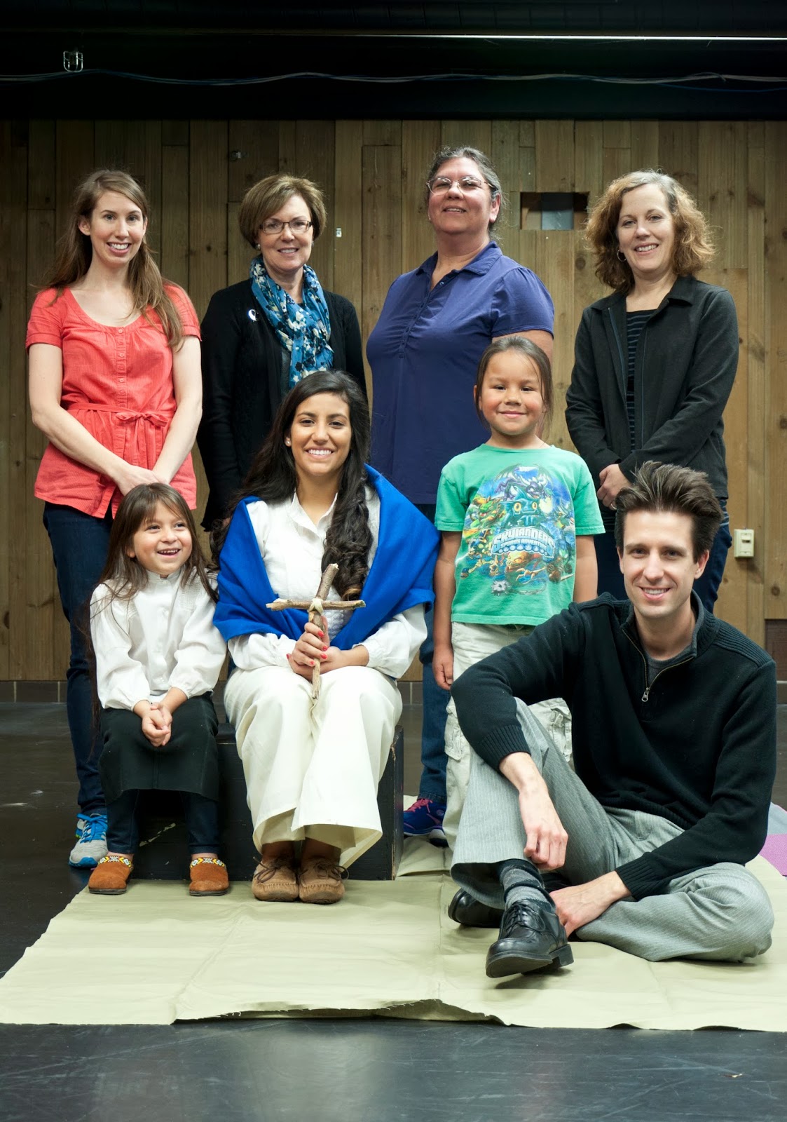
I am indebted to the Arthur C. Parker photo archive at the New York State Museum for much of the material I have used to make this painting. I am especially grateful for the assistance of Dr. Betty Duggan, Curator of Ethnography, which out which I would have been groping blindly in the dark.


Traditional Mohawk dress consisted of 5 primary elements. The blanket, the over-blouse, the skirt, The leggings, and the moccasins. We know very little about their dress before European contact, but from the writings of Hudson, Champlain, Smith, etc. a rudimentary picture can be formed. By St. Kateri's time, the Haudenosaunee were trading the the French, Dutch, and English, so European cloth had replaced whatever fabric or hides they had previously used. Especially in Canada, the trade allowed for access to European made garments, as well as fabric. But as in many things, the Native Americans absorbed and made things their own through alteration and embellishment. St. Kateri herself was held in high regard for her skill in these crafts.

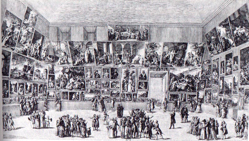
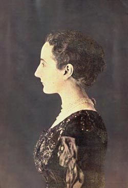
Once European contact had been made, images of the Haudenosaunee began to appear. I've previously commented on Verelst's court paintings. Other images circulated more widely, such as J. Laroque's etchings and Scotin's engravings. Most of these are considered heavily romanticized, and while predicated on some historical fact, they are indebted more to Dryden and Ashley-Cooper's concept of the Natural State than they are to a cultural understanding of the Iroquois.

Two images, and one object have been most useful to me in clothing St. Kateri. Unfortunately I don't have permission to reproduce them here, but all three are found in the catalog of the Auf den Spurer der Irokesen exhibition in Bonn and Berlin. The first is a doll from the collection of the National Maritime Museum in London. While it postdates St. Kateri by a century, it was made in the Canadian Mohawk community she called home. My second source are watercolors of Iroquois made by Millicent Mary Chaplin in the early 1800s in the collections of the Library and Archives of Canada, Quebec. The third are the drawings and lithographs of the clothing made by Carolyn Parker and her family, widely considered the foremost authorities on traditional Mohawk dress. By identifying the period embellishments and materials (industrial era steel needle embroidery vs. pre-industrial quill embroidery; linen and hemp fabric vs. cotton and silk) I believe it is possible to turn back the clock on the clothing and arrive at an approximation of the dress of a typical 17th century Iroquois woman.


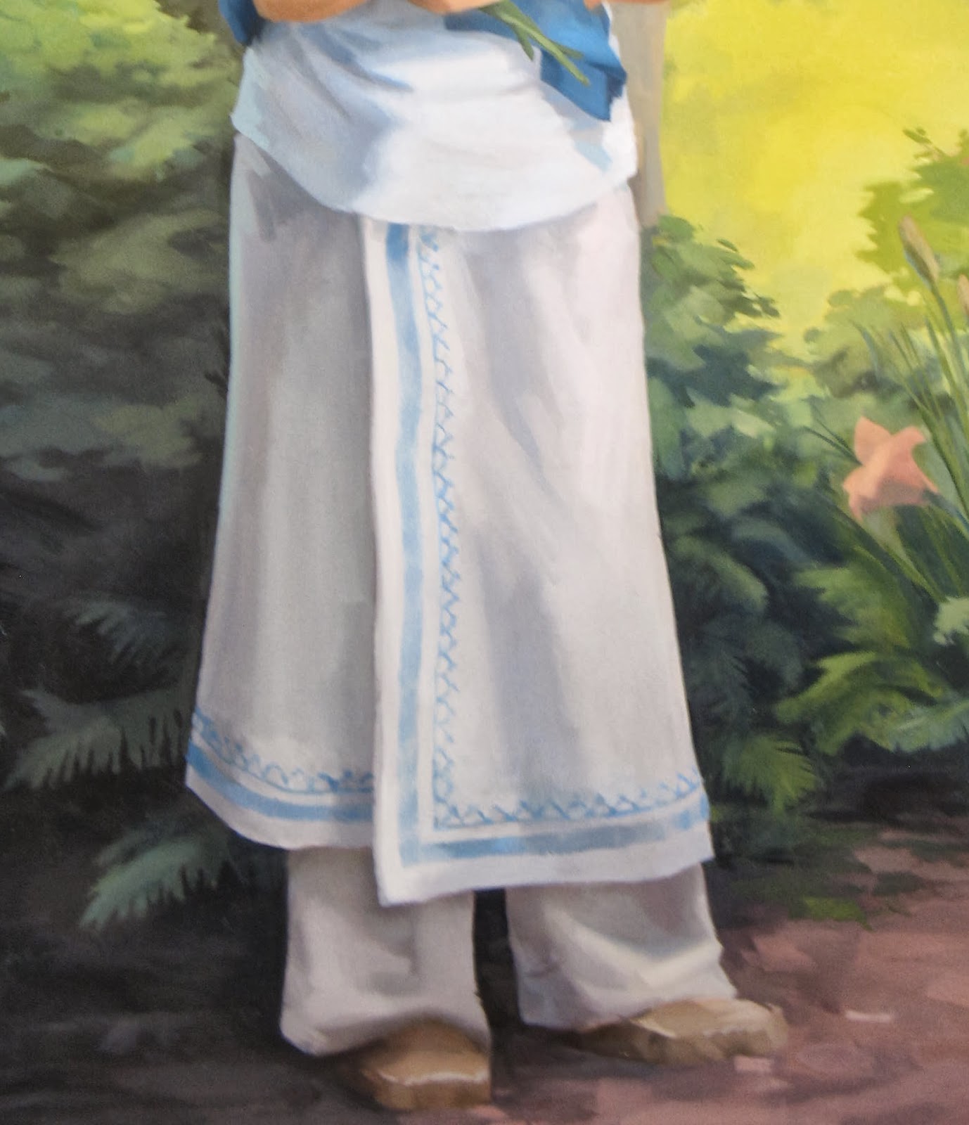
Her blanket I have painted in a brilliant indigo, reflecting the dye most likely employed by the Mohawk. It brighter than what we would normally see in blue jeans because the fabric of the blanket was a white trade cloth that St. Kateri would have dyed herself.  She wears it about her shoulders, as was the custom of the Mohawk, and was likely her preference in the shaded setting in which she appears.

Her blouse fits loosely, due to her petite frame, and is made of a coarse European fabric that she or her family had tailored. Many variations on the blouse exist and are recorded in drawings and etchings. Heavier blouses that covered the arms were typically worn in winter. They went sleeveless or topless in the summer, using the blanket when needed. Some beading was typical, but from the Jesuits we know that St. Kateri eschewed much of the ornamentation favored by young Mohawk women, so I have painted her blouse simply and unadorned as an undyed garment.

Her skirt is made from a heavy fabric that was wrapped around the waist. It may have been secured by a belt or cord.  Bead-work typically followed the edges of the garment. I've created a design based on patterns recorded by Arthur C. Parker, historian and ethnologist, and of the Seneca himself. The color of the pattern is indicative of the pale blue shellfish of which the beads were made from.  The pattern represents the dome-of-the-skies topped by the world tree. My bibliography contains a number of books that treat the subject of Iroquois arts and symbols in greater detail than I can here.

Many varieties of leggings seem to have been worn, some more elaborate, and others less so. I have chosen a simple loose fitting garment that would have served her well during the daily routine of the average Mohawk woman. They are simple and utilitarian, much like her moccasins. Of these, most were likely to have been made of animal hide. Moccasins consisted of a top flap and thicker bottom sole. The sole would have been wrapped up to cup the foot and sewn with sinew. More delicate and decorous moccasins may have been worn for social and ceremonial purposes, but these suit the simplicity of the rest of her garb.

© Arthur C Parker, from Certain Iroquois Tree Myths and Symbols


Monday, September 30, 2013

Flesh Tones


Most paint-makers have abandoned the ethnocentrist, if not outright racist, labeling of tubes of pale peach paint as "flesh tone." An honest and deliberate look around, even at those of paler complexions will reveal the variety of colors that compose our flesh. Everything from rich violets, electric oranges, soothing greens and delicate lavenders have I seen on the human body. Peach is a useful color, but the human body is more dynamic than that. My wife Katria's skin has beautiful purple shadows that turn to a grey-blue in reflected light.

The beauty of flesh lies in its translucent--light passes through it while also falling upon it. You've probably noticed this with ears and fingers, but it happens all over the body, causing the coloring of our surfaces to reveal our underlying architecture. Cooler highlights occur where bones are close to the surface, and our blood vessels can give a bluish cast to our form. Even the closest shave cannot diminish the grey or green cast of a man's jaw, due to hair follicles that lurk beneath the surface.

For St. Kateri I'm using the variety of hues in the above image. Some of the color is lost in the photograph. I use a variety of colors to mix flesh tones, but I generally rely on complementary color pairs. Cadmium Orange and Chrome Oxide Green have been indispensable to this painting. I use the combination in the foliage as well. Cadmium Red Light helps me to bring in a touch of the pink. Adding Cerulean greys the mixture. For shadows I start with a mixture of Viridian and Mars Orange, which I modify with small amounts of Mar Red or my cadmiums.

Thursday, September 26, 2013

What did she look like?


A few weeks into the painting I was unhappy with her facial expression and chose to rework the head. Nobody panic! This isn't what the painting looks like now. The image is from August. I've also changed the hands and fabric since then. Reworking an oil painting is never as simple as painting over with more paint. The most permanent and satisfactory results can only be achieved by scraping and re-grounding. But this image gives me an opportunity to talk about her face, without revealing yet this most important aspect of the painting------------------

-------which will be unveiled on October 21st at 7pm, location TBD

How does one go about capturing the likeness of a person who lived and died before the advent of photographic technology? In the best of all possible worlds a detailed portrait or drawing might have been made in the person's lifetime. But painters, as Plato knew, are not always honest--thus the threat to civil society. If we compare a photograph of Madame Gautreau, with the portraits made of her, one can certainly detect differences. 

There are many paintings of St. Kateri, but only one made by a contemporary, and that made between 2-10 years after her death. Could even someone with some skill in painting create an accurate description of a person years after seeing them? 

Despite the difficulty, there are a few things we know absolutely about St. Kateri. There are, additionally, many things we can deduce from a knowledge of the time period, and from the writings of her contemporaries. Two Jesuit priests, Claude Chauchetière and Pierre Cholenec were her biographers and are my primary sources for information on her life. Ultimately, I see this painting as a balancing act between the historical record, and--what we might term--the theological record. By that I mean the specific iconographic conventions of her depiction as well as the broader traditions of sacred art. What follows is brief discussion of the decisions I've made, in light of the research I've done, regarding her form an appearance. I'll write a separate post about the details of her dress

First and foremost, she is a Mohawk, but of Algonquin decent. I'm sure most of us have a mental image of a Native American, informed by Hollywood, Disney, etc. Many scholars have written about this aspect of visual culture, and it is a fascinating subject, but in summary, many of the depictions of Native Americans in cinema are heavily romanticized, containing anachronistic elements, and incorporating elements of traditional dress from multiple of tribes.

In the Jesuit records she is described as having weak eyesight. Cholonec and Chauchetiere differ in the severity of the ailment. Chauchetiere stresses that her bout with small pox nearly blinded her. Cholonec notes only that her eyesight necessitated a hood to shield her eyes in direct sunlight. It's surprising that two men, both knowledgeable about St. Kateri, could write so differently about this basic issue. Her name, Tekakwitha, can be understood as "she moves things aside." This may refer to her poor eyesight. Yet we also know, from the Jesuits and from the recollections of her companions, that she was a skilled craftswoman, especially with bead work. She was even employed to make wampum belts, one of the most important objects in the communal and diplomatic life of the tribe. These belts were beautifully and delicately embroidered. Her documented skill as a craftswoman leads me to conclude that her eyesight, while poor, could not have been very bad.

Based on these possibilities, I have painted her in a shaded woodland scene, and illuminated by soft, indirect light under the trees. In the paintings this is evidenced in the change of temperature between the background and middle ground (warm highlights, cool shadows) and the foreground (cool highlights: pinks, peaches, and light greys, and warm shadows: rich blues, oranges and warm greens) It is plausible therefore that she appear with her blanket about her shoulders, in traditional Mohawk fashion, rather than concealing her face, as she would have worn it under direct sunlight.

In the variety of paintings, drawings, and sculptures made of St. Kateri, only one have I found with pockmarks on her face. And the artist has done a great job of concealing them. Based on her interpersonal relationships recorded by the jesuits, her pock marks may not have diminished her innate beauty. When she lived along the Mohawk she had suitors, and while in Canada she was capable of instilling enough jealousy in other women to prompt an groundless accusation of adultery. From Claude Chauchetière biography we know that upon her death, St. Kateri's face changed. Her pock marks were removed, and her face was radiant. Because of this I've chosen not to paint her face with pockmarks, and in this, my painting is consistent with others. Indeed, even in Chauchetiere's own portrait of St. Kateri, she does not appear pockmarked. 

There is of course a convention of depicting saints with their corporal infirmities, but only where a postmortem appearance occurred in which they visibly retained those elements. Christ's scars are the most prevalent example of this. Others, such as St. Bartholomew--who was flayed--are depicted as in a "restored" body. Often St. Bart is depicted holding a limp suit of his skin, yet he is still painted with normal human skin, not as someone would actually look after having been flayed--with exposed viscera and musculature. I believe there's something to be said in favor of a body in glory. St. Kateri is not dead but is alive and with God. It has been my determination to balance her historical person (the mohawk physical features and traditional dress), with her present glory (removal of blemishes)

Saturday, September 21, 2013

Faith

© Julie Lonneman
St. Kateri has been a controversial figure in the centuries prior to her canonization. Indeed some of that controversy remains.  As is the case with many individuals who gave up the beliefs of their community to embrace the faith of others, there are conflicting thoughts about her among Native Americans. Devotion to St. Kateri has been strongest, not among the Haudenosaunee, but among the tribes and first nations of the western half of North America. It was among the plains tribes in the Dakota's and in Montana that an annual Tekakwitha Conference conference was established to strengthen and affirm the faith of Indigenous Catholics. The organizations name reflects the fact that it finds inspiration in the faith journey of St. Kateri

Certainly her faith is inspiring, but an aspect of St. Kateri's faith that I've not always know how to get my mind around has been her practice of mortification. We know through the Jesuit records that she and her companions frequently practiced often extreme forms of self chastisement and mortification. Indeed, the Jesuits themselves were shocked by the extent of their penitential practices, and tried to mollify their zeal with the introduction of more regulated European practices (see Allen Greer's Mohawk Saint: Catherine Tekakwitha and the Jesuits). Dr. Greer attempts to bridge the gap between the modern era at St. Kateri's time with an appeal to Nietzsche's conceptualization of christian asceticism. In summary, we in 21st century society are rarely made to suffer physically. We crave comfort and are disconnected from the corporeal realities that were so much a part of everyday life just a century ago. The ubiquity of bodily suffering in the past could precipitate an existential crisis if suffering could not be given meaning. Ascetic practices were one way that suffering could be given meaning and mastered. This observation makes a lot of sense to me. As a victim of epidemic disease, physical infirmity, warfare, and emigration, St. Kateri's adoption of ascetic practices may have been a way in which she gave meaning to this suffering.

A more compelling point of view, I think, I've found in Neal B. Keatings' Iroquois Art, Power, and History. I've been reading this book in tandem with a few others on the same subject, and my understanding of St. Kateri's ascetic practices has been heavily informed by information I've gleaned from authors discussing Haudenosaunee ritual, specifically the adoption ceremony that figures prominently in the initiation rites of the Mohawk community. The Iroquois viewed warfare as a way of expanding their community. The adoption ceremony often included torture, physical trial, and extreme physical endurance through which individuals were reborn into their adopted community. I don't think it's too far a stretch to say that St. Kateri could have understood mortification and penance in this light: as her initiation into her new faith. It is important to note however, that this initiation did not proceed upon a European, but rather a Mohawk path. She was making the catholic faith her own.

This, I think, is very significant. The traditions we've learned from a young age are very important, but ultimately we must all climb the mountain ourselves and make them our own. I like how Dylan Thomas expressed it in his poem No Man Believes.


Tuesday, September 17, 2013

The Landscape


Landscapes are something I enjoy painting a great deal. I like the way light and atmosphere interact. Especially here in Hudson valley. Since I move here, I've come to understand the quality of light that first moved painters like Cole and Church. My favorite, of the painters of the Northeast, is John Frederick Kensett. His Eaton's Neck, Long Island is one of his best. Seeing it today reminds of the first time I saw his work, in part one of the two volume Long Island Landscape Painting. I was amazed at his ability to turn such a boring scene into something so sensitive and immersive. It's quiet and unassuming, but as you can see from viewing it, his understanding of light is impressive. You can almost hear the soft flow of the tide and breathe the humidity in the air. A trip to the Metropolitan to view this painting--even if you saw nothing else in the museum--I think would be well worth the cost of the trip.

Understandably, St. Kateri is the subject of these paintings, but that doesn't mean I haven't enjoyed painting the natural environment that surrounds her, or that the environment can't be an important part of the composition. I have included many plants that are indigenous to the river valleys of upstate New York. Poplar trees, Cranberry and Northern Bayberry bushes, and a variety of the local lilies that grow in so many of wooded areas of the state. In the distance is visible a curve of the Mohawk river as it turns through Montgomery County. Here are a few details from the painting. It's coming along well and I look forward to showing it completed.


Tuesday, September 10, 2013

The End of Man


The title comes from a phrase in the Baltimore Catechism. I hope that I may be forgiven the use of non-gender neutral language. The phrase suggests something that is regurgitated in the art press every few years. People are always going on about whether or not painting may be dead since photography ended painting's monopoly on the narrative representation of the world. It's not something I'm particularly worried about, but I would like to speak to my motivations for persisting in the discipline of painting.

Even in the 21st Century, painting is still very vibrant and exciting. It stirs the imagination and the soul in a profound way. Oil paint in particular is, I think, a transubstantial substance. It is neither opaque, nor transparent; neither liquid, nor solid. It's soft translucency lends itself to the sculptural, and yet it is flat. Through it's veils a chromatic pentimento remains visible that recalls the barely apparent veins and fascia seen through flesh. Paint can be shaped and formed into an image, or manipulated with no referent other than its own color, volume, and texture. It exists on the palate in a neutral state, waiting to be formed, but it's color and physicality is suggestive of that transformation. Paint is actual and potential being. More to the point, it is both subject and substance. It is always both. Even on the canvas, after the painting is finished, it remains minerals and oil locked in a physical bond that oxygen will transform over days, years, and decades into a tight matrix. But it is also a person, a landscape, a still life. 

Moving in the other direction, even when it is on the palette, it is more than it seems. When it is an array of globs of ochre, cobalt, ferriammonium ferrocyanide, and cadmium, even as I pick up my brush and agitate it across the canvas, it is becoming something else. Ontologically, paint is difficult to pin down. I think that it is for this reason that painting will always draw it's adherents on. Certainly it is why I paint.

The images below speak to this point. They're all detail shots. There's little difference between a Pollock and a Rembrandt when you really get down to it. Both were smearing a splattering a viscous substance over a textured ground.


Neither are Anuskiewicz and Ghirlandaio very far apart in their technique. Notice the raking of the reds and greens, varied in density to create volume.


The best scholars and historians of art understand that paint is both subject and substance. Robert Hughes and James Elkins are a joy to read because of this. Laura Siedel and Erwin Panofsky actually have a lot in common in their readings of The Arnolfini Portrait. Both miss painting (the verb, not the noun). There's nothing more boring to read than an account of art that only accounts for the subject or its interpretation. As if the beauty of a Monet could be described in terms of haystacks and aquatic flora. There's much more to his paintings than that. It would be akin to saying religion consists solely of morality and rules for clean living. To say such things is to miss the deep needs and aspirations in which we all participate. That is to say, the end of man.


Friday, September 6, 2013

Corrections and Adjustments


There are many books about painting. Many of which have more or less specific directions which are not very useful. One can look to Cennino's Il Libro dell'Arte and find instructions regarding the painting of gangrenous flesh, or flesh pierced by a spear. Alternatively Doerner's The Materials of the Artist contains a description of Goya's method. Step 7 is "Easily and deftly draw the contours and refine them with loose reflected lights." That covers a lot of ground and, like Cennino's overly specific advice, doesn't help much.

Every painting reaches a point where there are no more steps. Ted Seth Jacobs, a draughtsman and Atelier instructor, has said that the greatest teacher is the blank page: every mark you make is right or we wrong based on its relationship to previous marks. It takes eyes to see, but it's all there on the canvas. In a sense the painting paints itself. 

So this is where I am. The grisaille has been painted, the coloring established, but from here on out it's me and the canvas, hand to hand. Each day I take stock of what I've painted the day before, and plan the day to come. I frequently have to adjust the drawing. By that I mean the placement of forms and the relationship of parts to the whole. In this you can see the lines I've drawn to modify her arms. I moved her shoulder down the other day, and if I don't adjust the position of her arms she'll look like gumby. Slowly it takes shape.

Tuesday, September 3, 2013

Blue

© Williamsburg Oil Colors

It's a favorite color. But their are so many varieties. When I was in high school I knew I needed a blue, red, and a yellow to paint. So I went out and bought some colors that looked interesting. I picked a cobalt blue hue (a mixture of ultramarine, phthalocyanine and white) and a naphthol red. I couldn't understand why my violets were muddy and flat. Fortunately since then I've figured out that red and blue don't make purple.

The optical properties of pigment necessitate that artists seeking to mimic the effects of light pick at least two of each primary, each tinted toward it's analogous hues. For instance, a purplish and a greenish blue would allow for a greater variety of mixtures than would a single primary blue.

The cost structure of blue paint has changed greatly over the years. For the medieval painter the best blues Ultramarine and Azurite were prohibitively expensive. Both are ground from semiprecious stones. The name of the former suggests it's origin: Ultra - Marine. Better yet, in French: Outre - Mer. Beyond the sea. The Frankish kingdom in Jerusalem. The spice trade brought this most exquisite of blues to Europe. It was the chemists Guimet and Gmelin who devised a means of synthesizing ultramarine from base materials. If ever there was an instance of an alchemical lead-into-gold procedure, this was one. The modern process brought ultramarine blue into reach for the common artist.

I'm using very little ultramarine these days. I primarily rely on Cerulean and Prussian blues. Cerulean is a stunning color. A weak tinter--especially the paint made by lower calibre color makers--but the only commonly available high key blue. Manganese was thought to be a good replacement, but it's toxicity has caused it to be rare these days.

Prussian Blue was invented by possibly the worst (or luckiest) alchemist in Berlin. Johann Jacob Diesbach was trying to synthesize a red pigment. But when a solution of ferric(iron)-chloride (red-orange in color) and a solution of potassium ferrocyanide (yellow-green in color) are mixed, the result is a bluish liquid, out of which will precipitate a blue pigment.

Friday, August 30, 2013

The Laying-In


The second half of my undergraduate education was spent studying with Jonathan Puls. I was at a small school, so he was the only show in town. He taught drawing, life drawing, painting, art history, and figure painting. Somehow he found time to paint as well. Among the many aspects of painting he taught me was that the painting only begins when the entire surface is covered. A painting is a lot to navigate, and it is important not to lose sight of the composition as a whole. So earlier this week, I pulled out my largest brushes and put as much color onto the canvas as I could. The paint is thin, so as to be ready to receive additional layers. The color is intense, to lend luminosity throughout the process. The bold colors are always exciting. As I began to paint I could feel myself jump a little, especially with the bright yellow. It's good for a person to be able to use such opulent and life-affirming paint.

Back to the painting. The laying-in, or dead-colouring, as Sir Joshua Reynolds termed it, is a very important stage of the painting. The idea is to say something about every area, from the darkest darks to the lightest lights. I need to know where the light will fall, where the shadows will lurk, and how the temperature will change through the composition. I've painted a number of smaller studies, so there aren't any real surprises for me here, although as I look at it completed, I've noticed a few adjustments in the body language I'd like to correct. You can see a bit of this in the photograph. She sees to be shrinking away due to the concave line of her form.

Tuesday, August 27, 2013

Grisaille


"Grisaille" is a fancy word for an underdrawing in monochrome. It is derived from the French "gris" and means "grey." It traditionally describes first step of the practice of the medieval and flemish masters, which involved creating an elaborate underdrawing, in a monochromatic higher key, which was then overpainted with glazes and scumbles of greater chroma and intensity. This unfinished painting of Christ and the Woman Taken in Adultery by Peter Bruegel the Elder is an example of the technique. As is often the case, necessity was the mother of this invention. The lack of intense opaque pigments meant that artists desirous of bright coloring, must take advantage of the optical properties of transparent pigments to achieve their goal.

As artistic practice evolved and more opaque colors were introduced this function of the grisaille changed as well. Baroque painters like Velazquez and Titian employed orange and red ground for the purpose of modeling flesh by varying the opacity of their lights and darks. The effect of the red ground is masterfully employed in Velazquez's Vulcan's Forge, where many of the warm notes in the flesh are nothing more than the ground showing through his brushwork. His contemporaries would see his work and exclaim: "It is made of nothing... but there it is!"

My use of a grisaille will be similar to this last example. Most of the painting will be opaque, but especially in the flesh, this underlying warmth will give the painting more vigor. I use raw umber to draw out the composition, and to model the values in the shadows. As cool color, the umber allows me to develop the temperature relationships in the flesh and establish the greys, greens, and blues that often show up in shadows on the human form.