Showing posts with label Materials. Show all posts

Thursday, November 14, 2013

Time to Make Another Painting


Now that the semester is winding down, I'm getting ready to begin another painting. I cleaned up my studio and have started work preparing for the next painting: St. Kateri Tekakwitha and the Children. If you were reading this summer, you already know that a lot of work goes into a painting before I can even start mixing paint, but don't worry, I'm not planning on repeating everything I previously wrote about priming, sizing, grounding etc. 

I did, however want to share a couple recent publications that deal with painting on rigid and flexible supports. Some of the information was quite new to me, and in fact, some recent research contradicts the the long established practice of many painters. 

Golden Pigment's Just Paint probably isn't something the arm-chair art enthusiast would be interested in reading. There's a lot of shop talk. Even artists have to sift through some technical and trade jargon. But there's a lot of great stuff in each issue. Volume 28, from last winter focused on flexible painting supports. There's a great analysis of a variety of sizing and priming treatments. Nothing new. All well established arguments. I'm preparing my next canvas (as I did the first) along the same lines.

It was the most recent volume that was so surprising to me. The phrase, "wrecking ball" comes to mind. In an article on the history of wood as a painting substrate, the author stresses the advantages of S2S hardboards (or tempered hardboard, masonite, etc.) for permanent paintings, over other medium and high density boards. Most artist handbooks are very negative regarding tempered boards. I avoided them for years and spend hours calling lumber yards in search of untempered paneling. The article is a little sparse on the technical data that would support that argument, so hopefully more will be forthcoming. It would be a major boon if there turns out to be no conservational objection to tempered boards. Of course all wood based painting substrates would need to be completely sealed and primed with an archival glue. 

Wednesday, November 6, 2013

Painting Demonstrations


The images above are a painting demonstration I did recently for my Painting I class. They're putting together the skills they've developed so far in the areas of value modeling, color mixing, and temperature relationships. To understand the way that color relationships function to create unity and space, they make two paintings, one of which conforms to a grid. It ends up looking like an old 8 bit NES game--but the space and unity of each image is the same, despite the loss individual objects. Often in class I challenge them to subordinate the details to the whole. The grid image is a pure expression of that concept.

I took my class up to my studio the other day to show them my work. I told them that I wanted to show them that the things I do professionally are rooted in the things they're doing in class. Painting can be a mysterious activity. Some painters, with the help of historians and curators cultivate this. Jacques Maroger, who claimed to have discovered the "lost medium" of Da Vinci et. al. would say of Rubens: "he was a good painter, but he didn't have the medium". An interesting episode in the late 18th century involved a chimney sweep, The English Royal Academy, a matter of 600 - 1000 pounds sterling, and the secrets of Titian. I doubt anyone made any better paintings after they acquired the secret.

Salvador Dali may have gone in for such things as the Wasp Medium--or genuine amber varnish for that matter--but I try to keep it simple in my studio, and in my classroom. I'll often paint demonstrations so my student have the opportunity to see a painting go from start to finish, as well as to see the problem solving that goes on while making a painting. The image above is one such demonstration. I use the same paints and brushes as my students, so they know I'm not trying to pull a fast one on them. There's little more to it than mixing the right color, and sculpting with that and other hues on the canvas.

You've all seen some in process shots from a head study I painted recently. I hope to post another, and more complete demonstration at a later date. Until then, through this link you can access an artist lecture I gave a year or two ago at the Foundry for Design + Culture.

Thursday, October 31, 2013

Composing a Painting


© David Hockney

I had a question from a student about how I put this painting together, whether I had worked from a photograph, or from life. The answer is somewhere in between, and needs some framework to be fully understood.

Making a painting entirely from life was rare until the 19th century. Scholars believe that the incised marks that litter Caravaggio's canvasses as evidence that he departed from the usual conventions and worked from life. It was the pride of French realists such as Gericault or Corbet, that they often worked from life. The Impressionist Monet practically turned this into an obsession, switching canvases every fifteen minutes to remain faithful to changes in light. More recently Antonio Garcia Lopez has worked this way on his massive landscape paintings of Madrid. He typically works a few minutes a day for years on a single painting. There is a simplicity and directness about working from life. Some, such as John Ruskin, have attached a moral virtue to working from life. Yet often the scale, complexity, or even the weather preclude working from life. In such circumstances artists have turned to reference material in one form or another to guide their practice.

Being a recent invention, photography only became an important tool for painters in the past 150 years. Thomas Eakins worked out compositions and refined his drawing with reference to photographs. Prior to this, painters learned to work from their drawings. Sketches served as references. The trois crayons technique was uniquely suited for preserving value and temperature information from which a painter could develop a composition. Similar, artists would refer to the works of their colleagues in the form of drawing or paintings. When the original works were not accessible, prints would serve. One of the primary motives behind the formation of the European academy was to afford students access to visual libraries or the work of the Masters. Curators are fond of pointing out the borrowing of visual tropes on the didactics that line museum walls. Consider the similarities of Noah and Manoah in two these paintings by Natoire and Murat. Kehinde Wiley is a contemporary artist known for his appropriation of art history, as in this piece, which hangs in the Brooklyn Museum.

From the Renaissance to the Modern era, history painting, such as exemplified in the work Laurence Alma Tadema, or Charles Le Brun, occupied the highest position within the discipline of painting--as opposed to genre, still-life, landscape, or portraiture--because of the skill required to compose such a work. They required erudition, as well as the technical skill to orchestrate multiple studies into a single cohesive whole. The best painters in this vein cultivated a certain showmanship and sense for drama. They needed to be able to cut to the quick of a narrative and capture subtleties of emotion and body language. I would consider them more akin to film makers today. A good history painting tells a story in a single moment, but it wasn't possible to paint one in a single sitting, or even from a single reference. Artist brought in models, made sketches, and united these into a single image, much like David Hockney creates a single image from multiple photographs above.

I completed St. Kateri in God's Creation using such a methodology. I had the benefit of a model, and took a couple gigabytes worth of photographs. I worked from three distinct images to create her body--one for general body language, a second for the head, and a third for the lower limbs. I made use of additional sittings for the hands and eyes with a second model. The landscape came from sketches and photographs made in the Mohawk Valley and on campus at Siena. The ferns grow in a park near the river, but the lilies are located outside of the Sarazen Student Center. Through a careful study of light and color these disparate elements are united into a single, unified whole.

Monday, September 30, 2013

Flesh Tones


Most paint-makers have abandoned the ethnocentrist, if not outright racist, labeling of tubes of pale peach paint as "flesh tone." An honest and deliberate look around, even at those of paler complexions will reveal the variety of colors that compose our flesh. Everything from rich violets, electric oranges, soothing greens and delicate lavenders have I seen on the human body. Peach is a useful color, but the human body is more dynamic than that. My wife Katria's skin has beautiful purple shadows that turn to a grey-blue in reflected light.

The beauty of flesh lies in its translucent--light passes through it while also falling upon it. You've probably noticed this with ears and fingers, but it happens all over the body, causing the coloring of our surfaces to reveal our underlying architecture. Cooler highlights occur where bones are close to the surface, and our blood vessels can give a bluish cast to our form. Even the closest shave cannot diminish the grey or green cast of a man's jaw, due to hair follicles that lurk beneath the surface.

For St. Kateri I'm using the variety of hues in the above image. Some of the color is lost in the photograph. I use a variety of colors to mix flesh tones, but I generally rely on complementary color pairs. Cadmium Orange and Chrome Oxide Green have been indispensable to this painting. I use the combination in the foliage as well. Cadmium Red Light helps me to bring in a touch of the pink. Adding Cerulean greys the mixture. For shadows I start with a mixture of Viridian and Mars Orange, which I modify with small amounts of Mar Red or my cadmiums.

Tuesday, September 10, 2013

The End of Man


The title comes from a phrase in the Baltimore Catechism. I hope that I may be forgiven the use of non-gender neutral language. The phrase suggests something that is regurgitated in the art press every few years. People are always going on about whether or not painting may be dead since photography ended painting's monopoly on the narrative representation of the world. It's not something I'm particularly worried about, but I would like to speak to my motivations for persisting in the discipline of painting.

Even in the 21st Century, painting is still very vibrant and exciting. It stirs the imagination and the soul in a profound way. Oil paint in particular is, I think, a transubstantial substance. It is neither opaque, nor transparent; neither liquid, nor solid. It's soft translucency lends itself to the sculptural, and yet it is flat. Through it's veils a chromatic pentimento remains visible that recalls the barely apparent veins and fascia seen through flesh. Paint can be shaped and formed into an image, or manipulated with no referent other than its own color, volume, and texture. It exists on the palate in a neutral state, waiting to be formed, but it's color and physicality is suggestive of that transformation. Paint is actual and potential being. More to the point, it is both subject and substance. It is always both. Even on the canvas, after the painting is finished, it remains minerals and oil locked in a physical bond that oxygen will transform over days, years, and decades into a tight matrix. But it is also a person, a landscape, a still life. 

Moving in the other direction, even when it is on the palette, it is more than it seems. When it is an array of globs of ochre, cobalt, ferriammonium ferrocyanide, and cadmium, even as I pick up my brush and agitate it across the canvas, it is becoming something else. Ontologically, paint is difficult to pin down. I think that it is for this reason that painting will always draw it's adherents on. Certainly it is why I paint.

The images below speak to this point. They're all detail shots. There's little difference between a Pollock and a Rembrandt when you really get down to it. Both were smearing a splattering a viscous substance over a textured ground.


Neither are Anuskiewicz and Ghirlandaio very far apart in their technique. Notice the raking of the reds and greens, varied in density to create volume.


The best scholars and historians of art understand that paint is both subject and substance. Robert Hughes and James Elkins are a joy to read because of this. Laura Siedel and Erwin Panofsky actually have a lot in common in their readings of The Arnolfini Portrait. Both miss painting (the verb, not the noun). There's nothing more boring to read than an account of art that only accounts for the subject or its interpretation. As if the beauty of a Monet could be described in terms of haystacks and aquatic flora. There's much more to his paintings than that. It would be akin to saying religion consists solely of morality and rules for clean living. To say such things is to miss the deep needs and aspirations in which we all participate. That is to say, the end of man.


Tuesday, August 27, 2013

Grisaille


"Grisaille" is a fancy word for an underdrawing in monochrome. It is derived from the French "gris" and means "grey." It traditionally describes first step of the practice of the medieval and flemish masters, which involved creating an elaborate underdrawing, in a monochromatic higher key, which was then overpainted with glazes and scumbles of greater chroma and intensity. This unfinished painting of Christ and the Woman Taken in Adultery by Peter Bruegel the Elder is an example of the technique. As is often the case, necessity was the mother of this invention. The lack of intense opaque pigments meant that artists desirous of bright coloring, must take advantage of the optical properties of transparent pigments to achieve their goal.

As artistic practice evolved and more opaque colors were introduced this function of the grisaille changed as well. Baroque painters like Velazquez and Titian employed orange and red ground for the purpose of modeling flesh by varying the opacity of their lights and darks. The effect of the red ground is masterfully employed in Velazquez's Vulcan's Forge, where many of the warm notes in the flesh are nothing more than the ground showing through his brushwork. His contemporaries would see his work and exclaim: "It is made of nothing... but there it is!"

My use of a grisaille will be similar to this last example. Most of the painting will be opaque, but especially in the flesh, this underlying warmth will give the painting more vigor. I use raw umber to draw out the composition, and to model the values in the shadows. As cool color, the umber allows me to develop the temperature relationships in the flesh and establish the greys, greens, and blues that often show up in shadows on the human form.

Friday, August 23, 2013

Materials


I get to play with a lot of fun toys. It is a matter of personal pride and good craftsmanship that artists have often sought to make beautiful paintings with beautiful materials. The finest, and most expensive materials have traditionally been reserved for the most important subjects. The blue of the Madonna's robe is one such example. Few artists today use gold leaf and genuine lapis-- $170 for 5 grams.  

I know I probably get more excited about these sorts of things than most. Consider that I wrote three posts about preparing a surface upon which to paint. For those who are interested, a word about what I'm using to make the painting.

Some artists are very mysterious about their materials, as if a neophyte bought a jar of the right stuff she might but the master out of business. It's ridiculous that the any substance, like a philosopher's stone, could transform a mediocre painting into something great. I suppose that the difficulty of painting, its slow learning curve, and the transubstantial beauty of the great works of art do provoke such speculation.

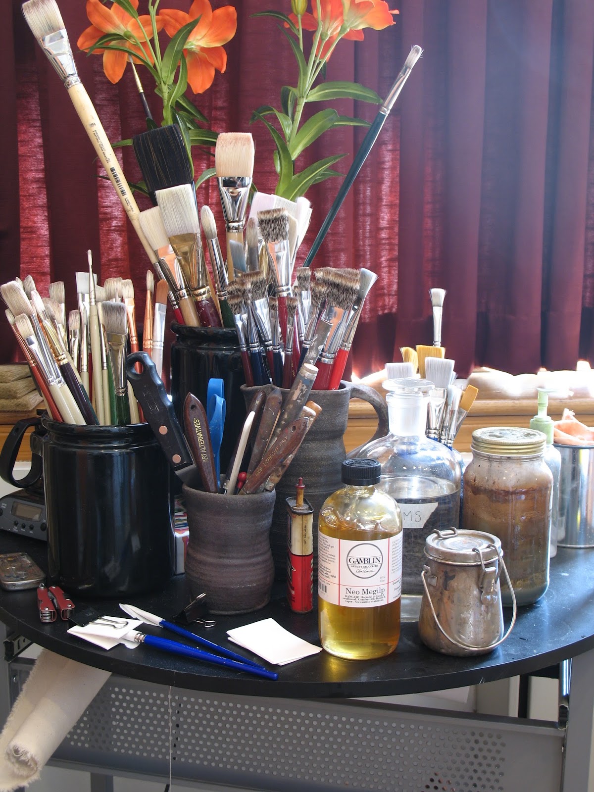
I use very little besides oil paint and mineral spirits. When painting into wet paint I like to use Gamblin's Neo Megilp. Sometimes I make my own medium with stand oil and mineral spirits. There's nothing special about my mediums. Grumbacher, Winsor & Newton, and probably every other company makes something similar. I like Gamblin because they make high quality products which are as non-toxic and environmentally friendly as possible. Rather than send the pigment dust from their air filters to a landfill, they make paint from it, and hold a competition. Come by my classroom on September 27th to participate. Materials provided.


I use Williamsburg paint. It's made in the US. It used to be made by hand by Carl Plansky. Now they're a Golden brand, but are still made in small batches according to Carl's recipes. It's the best paint. The Cadillac of paint. I don't tolerate differences of opinion on this subject. I will concede that Old Holland and a few others might be as good. Winsor and Newton I have a soft spot for, as a watercolorist. But I've used a lot of paint, and nothing compares to Williamsburg Cadmiums. Their Cerulean is like the singing of the angels. Of their Viridian, Guignet would be proud. Even their Yellow Ochre is spectacular. To use other paints after using these is depressing. Concern for my students finances compels me to include a less expensive paint in their supply kits, but do try to make a good case for buying the best.

Regarding brushes, the bigger the better, says Da Vinci. The best brushes are made in Germany, of the hair of the finest Chongqing hogs. Don't worry: they're being slaughtered for their pork. So painters need not worry that animals are being harmed. It's good to make use of the whole animal. The Czech Republic used to raise some pretty good hogs, but no more. With brushes, brands don't matter. If a company is buying high quality materials, they're not going to spoil them with shoddy craftsmanship. If it says Chongqing bristle, you're getting the good stuff. I also like sable brushes and lettering brushes for more delicate work. Dick Blick makes a scholastic "one stroke" and Utrecht a Sablette, both of which I use a lot. They're so cheap you can just throw them out rather than clean them if you like. 

Monday, August 12, 2013

The Canvas Part III


I'm entering the home stretch... by that I mean that I'll soon be able to paint on the canvas I've been assembling over the past month. The last step in the process is the application of the imprimatura. That's a fancy way of saying that I'm tinting the white ground with another color. This is the fastest drying component of the priming process, and probably the most fun. I get to smear and scrape paint over canvas. It helps to be aggressive and grind the paint into canvas. This allows for a very thin and fully bound paint film. Over dilution with solvent (OMS) or an oil medium will lead to a cracking, or "alligatoring" paint film. It goes on pretty glossy, but will dry flat. 

The purpose of the imprimatura is mainly to obscure the white (making it easier to gauge color mixtures) and to provide unity to the composition where it breaks through.

On another subject, you can see a bit of a head study I've painted of Lauren in the photograph above. I'll post pictures of a completed study at a later date. Stay tuned.


Thursday, August 1, 2013

The Canvas Part II


The glue sizing is dry, so I've started priming the canvas. The primer is lean, and made of very little oil, a lot of pigment, and alkyd resin to speed the drying. Today Titanium white is the most common primer pigment. It's durable, lightfast, and brilliant--reflecting up to 98% of visible light. But Titanium white was only made available to artists in the 20th century. Zinc white enjoyed a brief spot in the limelight in the late 19th century. Zinc is very brittle. Before that Lead Carbonate was used. But unlike the hide glues that are rarely used today, Lead White (or its variants: Flake White, Blanc D'argent, and Cremnitz White) still enjoys wide usage. The reason has to do with its drying properties. Lead is a progressive drier, and a catalyst to the oxidation reaction that causes the "drying" of the paint film. Unlike other colors, lead white dries internally as well as externally. While this is desirable in the paint film, it's actually pretty bad in the priming layers. Because the lead white undergoes a rapid expansion and contraction (caused by the acquisition of oxygen molecules, and the heat generated by chemical bonding) it's best not to paint on a lead primed canvas for at least 6 months. Fortunately, this is something I don't have to worry about with more modern Titanium white and alkyd resin primers.


When priming, it's better to do multiple coats rather than a single thick coat. This leaves the canvas more flexible, and ensures that the pa inting will dry more uniformly. The primer is very sticky, but I've gotten pretty good at keeping it off of my hands and clothes. Each coat of primer has to be scraped on with a knife. It's a slow process. The first coat takes a couple hours to apply and at least a week to dry, but after that things speed up. The whole process is pretty hard on my palette knives. In fact I've broken a few from the pressure. But a while ago I switched to a Holbein knife--the Cadillac of palette knives. They're expensive, but they're hand forged, allegedly by a samurai sword smith. I've found the primer coats applied with this knife to be more even--and I've never broken a knife.

While I'm getting the large canvas ready, I've also built a number of smaller canvases for sketches and studies. Next week, when everything is dry, I'll paint a small head study of my model.


Thursday, July 25, 2013

The Canvas


My materials are in and I've started to prepare the canvas for painting. The first step is to give it a preliminary stretch and allow the fibers to adjust to the frame. I've loosely tacked it to a stretcher. It will get two coats of a diluted glue (or sizing, in the technical jargon) before I apply the ground (a white, semi absorbent oil-based coating that supports the paint film). The sizing serves to seal the canvas and prevent oil in the ground and paint from seeping into the canvas fibers. Traditionally this was done with a glue of animal origin. Isinglass from the swim bladders of russian sturgeons, or natural gelatin from rabbit skins are two of the more common variants of historical glues. Many painters today still use these glues. I prefer a polyvinyl acrylic adhesive (PVA) for my canvasses. PVA glue has largely replaced the animal hide glues for conservators around the globe. It has the advantage of being ph neutral, non-yellowing, and less hygroscopic than other glues, yet it remains totally reversible. This would allow an experienced conservator the ability to separate the paint film from the canvas, should anything happen to the canvas. Kind of a terrifying thought, but it's reassuring to know that the painting could be preserved even if the canvas was damaged by moisture, mold, or insects. A great read about adventures in art conservation is Jonathan Harr's The Lost Painting.