Documenting my progress as I paint two portraits for the St. Kateri Parish in Schenectady New York.
Showing posts with label St. Kateri Tekakwitha in God's Creation. Show all posts
Monday, March 31, 2014
High Resolution Photography
Currently the painting is out being photographed. I told a friend I that after I finished the painting I'd be taking it down to McGreevy's. It was around St. Patrick's Day. He thought I was going to go out drinking with a large canvas is tow. McGreevy's is a local photography lab that has a camera capable of photographing large artwork for reproduction at full scale. That results in a pretty large file. A single uncompressed image of work on the scale of the two St. Kateri Tekakwitha Paintings might get as large as a gigabyte. What results is an image in which every brushstroke is visible, and which can be reproduced at a large scale. Above is a 6" x 6" section from the first painting.
Tuesday, October 22, 2013
Unveiled
Last night I had a great time at the St. Kateri Tekakwitha Parish during the public unveiling of the new portrait. I've had a great time making it, and it looks beautiful in the church. With this post, the painting is also unveiled on the web. The photograph comes from the McGreevy Prolab & Propress in Albany. It's a top notch photo, but no photograph can really do justice the a real painting. I'd encourage anyone viewing this on the web to consider a trip to the church at 2216 Rosa Road to see the painting. It will be hung on Thursday and blessed during an upcoming mass.
I'll have some video and news paper photo's up here as well as the week goes on. Let's start with these, from the Schenectady Daily Gazette, and short video from the Parish's facebook page.
Tuesday, October 15, 2013
Framing
Well, there it is. It's finished and in its frame. It looks great. Next week, the curtain comes off at 7pm at 2216 Rosa Road in Schenectady.
No one ever buys a painting because of its frame--except perhaps Rowan Atkinson--but a bad frame can really turn people off. Good framing is an art in itself, so I was happy to take the painting to the Clement Gallery in Troy and rely on their expertise.
Today framing happens after a painting has been completed, but this hasn't always been the case, and indeed is only possible when convention dictates a simple frame. When frames were more ornate, artists such as Millet, or even Van Gogh, preferred to put this finishing touches on their paintings after framing "I can only finish in a frame," Vincent wrote to his brother Theo. Gold has always been a popular choice for picture framing, either imitated or with the application of leaf. A beautiful painting was a treasure, and a gold frame drew attention to that fact. The purpose of leaf has always been to imitate solid gold. So modern frames that leave the edges of the leafing visible, reflect our preference for the appearance of age, whereas in centuries past it would have meant shoddy workmanship.
Today smaller frames are popular, but that has a lot to do with the convention of hanging a single work on the wall with plenty of breathing room. The "white cube" of Brian O'Doherty being the dominant aesthetic for the past 40 years. Within the last decade, this preference for extreme neutrality surrounding the artwork has meant that artists often frame their work in white frames. This would have been unheard of a generation ago, but now you can't swing a dead cat in Manhattan or Brooklyn without hitting contemporary art in a white frame. During the 18th and 19 centuries it was rare for a single work to be given such primacy on the wall. It would be an understatement to call the exhibitions cluttered. Artists fought for attention by building larger and more elaborate frames--it was the only way you could ensure space between the spot where your painting ended, and another bagan. To have one's work alone on a wall was a rarity, and artists took advantage of such occasions as they presented themselves. While he probably thought of the painting as one component of a beautifully crafted room, the egotistical painter in me likes to believe that Whistler designed an entire room as a "frame" for one of his paintings.
While the fashion of framing has changed over time, but they essentially serve the dual purpose of protecting the edges of the artwork and, in absorbing the weight of the painting itself. Of course, that is the bare minimum a frame can accomplish. I think that a frame should call the work out from the wall and subtly compliment it's coloring, without looking "matchy." It should have an elegant and understated formality or professionalism, much like a classically cut suit, or Chanelle's timeless little-black-dress. For the painting St. Kateri Tekakwitha in God's Creation, the committee and I picked out an elegant wood frame that brings out the natural luminosity of the painting, and will mesh well with the environment of the church.
Thursday, October 10, 2013
Unveiling October 21, 7pm, 2216 Rosa Road
![]() |
| © Charles Wilson Peale |
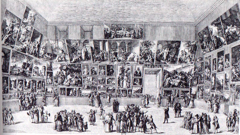
On the more positive side, and as the visitors to Olana are told, crowds waited in long lines for the unveiling of Frederic Edwin Church's latest landscapes in the later half of the 19th century. The Civil War was over, and the nation needed new narratives and mythologies about their relationship to the New World. They found it in the pristine, edenic paintings of the Hudson River School painters. These monumental canvases showed the sublime western landscape unstained by violence and ideology. North and South could be united in their subjugation the West. At the forefront of the movement was Church, who travelled who toured the east packing theaters and exhibition halls with eager audiences. He was kind of like Elvis. Young women swooning as he tore the curtain off his latest masterpiece. Young men practicing their brushwork and glazing, dreaming of galleries and museums. Parents disapproving of the "new art" of landscape painting. Give me a Charles Wilson Peale any day over this garbage they would say. (Or for the radically conservative--Sir Benjamin West).
All this is to say that the painting, St. Kateri Tekakwitha in God's Creation, will be unveiled on October 21st, at 7:00pm in the church at 2216 Rosa Road. Hope to see you all there.
Friday, August 30, 2013
The Laying-In
The second half of my undergraduate education was spent studying with Jonathan Puls. I was at a small school, so he was the only show in town. He taught drawing, life drawing, painting, art history, and figure painting. Somehow he found time to paint as well. Among the many aspects of painting he taught me was that the painting only begins when the entire surface is covered. A painting is a lot to navigate, and it is important not to lose sight of the composition as a whole. So earlier this week, I pulled out my largest brushes and put as much color onto the canvas as I could. The paint is thin, so as to be ready to receive additional layers. The color is intense, to lend luminosity throughout the process. The bold colors are always exciting. As I began to paint I could feel myself jump a little, especially with the bright yellow. It's good for a person to be able to use such opulent and life-affirming paint.
Back to the painting. The laying-in, or dead-colouring, as Sir Joshua Reynolds termed it, is a very important stage of the painting. The idea is to say something about every area, from the darkest darks to the lightest lights. I need to know where the light will fall, where the shadows will lurk, and how the temperature will change through the composition. I've painted a number of smaller studies, so there aren't any real surprises for me here, although as I look at it completed, I've noticed a few adjustments in the body language I'd like to correct. You can see a bit of this in the photograph. She sees to be shrinking away due to the concave line of her form.
Tuesday, August 27, 2013
Grisaille
"Grisaille" is a fancy word for an underdrawing in monochrome. It is derived from the French "gris" and means "grey." It traditionally describes first step of the practice of the medieval and flemish masters, which involved creating an elaborate underdrawing, in a monochromatic higher key, which was then overpainted with glazes and scumbles of greater chroma and intensity. This unfinished painting of Christ and the Woman Taken in Adultery by Peter Bruegel the Elder is an example of the technique. As is often the case, necessity was the mother of this invention. The lack of intense opaque pigments meant that artists desirous of bright coloring, must take advantage of the optical properties of transparent pigments to achieve their goal.
As artistic practice evolved and more opaque colors were introduced this function of the grisaille changed as well. Baroque painters like Velazquez and Titian employed orange and red ground for the purpose of modeling flesh by varying the opacity of their lights and darks. The effect of the red ground is masterfully employed in Velazquez's Vulcan's Forge, where many of the warm notes in the flesh are nothing more than the ground showing through his brushwork. His contemporaries would see his work and exclaim: "It is made of nothing... but there it is!"
My use of a grisaille will be similar to this last example. Most of the painting will be opaque, but especially in the flesh, this underlying warmth will give the painting more vigor. I use raw umber to draw out the composition, and to model the values in the shadows. As cool color, the umber allows me to develop the temperature relationships in the flesh and establish the greys, greens, and blues that often show up in shadows on the human form.
Subscribe to:
Posts (Atom)