Friday, August 23, 2013

Materials


I get to play with a lot of fun toys. It is a matter of personal pride and good craftsmanship that artists have often sought to make beautiful paintings with beautiful materials. The finest, and most expensive materials have traditionally been reserved for the most important subjects. The blue of the Madonna's robe is one such example. Few artists today use gold leaf and genuine lapis-- $170 for 5 grams.  

I know I probably get more excited about these sorts of things than most. Consider that I wrote three posts about preparing a surface upon which to paint. For those who are interested, a word about what I'm using to make the painting.

Some artists are very mysterious about their materials, as if a neophyte bought a jar of the right stuff she might but the master out of business. It's ridiculous that the any substance, like a philosopher's stone, could transform a mediocre painting into something great. I suppose that the difficulty of painting, its slow learning curve, and the transubstantial beauty of the great works of art do provoke such speculation.

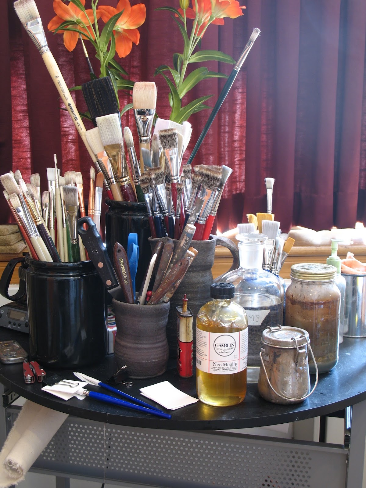
I use very little besides oil paint and mineral spirits. When painting into wet paint I like to use Gamblin's Neo Megilp. Sometimes I make my own medium with stand oil and mineral spirits. There's nothing special about my mediums. Grumbacher, Winsor & Newton, and probably every other company makes something similar. I like Gamblin because they make high quality products which are as non-toxic and environmentally friendly as possible. Rather than send the pigment dust from their air filters to a landfill, they make paint from it, and hold a competition. Come by my classroom on September 27th to participate. Materials provided.


I use Williamsburg paint. It's made in the US. It used to be made by hand by Carl Plansky. Now they're a Golden brand, but are still made in small batches according to Carl's recipes. It's the best paint. The Cadillac of paint. I don't tolerate differences of opinion on this subject. I will concede that Old Holland and a few others might be as good. Winsor and Newton I have a soft spot for, as a watercolorist. But I've used a lot of paint, and nothing compares to Williamsburg Cadmiums. Their Cerulean is like the singing of the angels. Of their Viridian, Guignet would be proud. Even their Yellow Ochre is spectacular. To use other paints after using these is depressing. Concern for my students finances compels me to include a less expensive paint in their supply kits, but do try to make a good case for buying the best.

Regarding brushes, the bigger the better, says Da Vinci. The best brushes are made in Germany, of the hair of the finest Chongqing hogs. Don't worry: they're being slaughtered for their pork. So painters need not worry that animals are being harmed. It's good to make use of the whole animal. The Czech Republic used to raise some pretty good hogs, but no more. With brushes, brands don't matter. If a company is buying high quality materials, they're not going to spoil them with shoddy craftsmanship. If it says Chongqing bristle, you're getting the good stuff. I also like sable brushes and lettering brushes for more delicate work. Dick Blick makes a scholastic "one stroke" and Utrecht a Sablette, both of which I use a lot. They're so cheap you can just throw them out rather than clean them if you like. 

Monday, August 19, 2013

Head Studies


Sargent is reputed to have said that "a portrait is a painting with something wrong with the mouth." I used to think that he meant that is it hard to paint a face. After having painted a head or two I understand that there is something about a face that is unique, but that there is a lot more that we all share in common. If a painter captures the former, without the later, the viewer thinks the face looks wrong, regardless how successful a likeness has been created. Think about it: have you ever had a photograph taken of yourself and thought "I don't really look like that, do I?" The truth is that you don't and that a photograph isn't you, simply because an image frozen in time has little relationship with a dynamic reality. It is the portrait painters job to understand the anatomical, emotional, muscular, and chromatic components that constitute a person's visage, to orchestrate the unity of those elements, and to communicate that unity through paint.

In order to begin making a portrait it is essential to understand the human form, especially it's more complicated components, such as the head. It's very common for painters to make multiple studies of the subject's head either from life or from photographs. Returning to Sargent, a great many studies for his audacious portrait of Virginie Gautreau (Madam X) are visible in Volume VI of his Complete Paintings. Many of the studies are most understandable a rehearsals of the brushwork.

Below you'll see in process photographs of the second study I've painted of Lauren's head. Compared to the first I'm getting a much better understanding of the architecture of her form. The modulation of warm and cool tones I'm starting to explore in greater depth. I painting pretty fast, and working on these as I finalize my preparations for the real painting. I'm happy with the color and modeling in this sketch.

In-process photographs are visible below


Thursday, August 15, 2013

Model

Modeling is kind of like acting I think. It requires an awareness of ones body and a kinetic memory. It's great to work with someone who who understands this. If I try too hard to cajole and prod a person into the right pose the results are rarely any good. Those wooden artist manikins come to mind. Everyone has them, but does anyone use them?

I've been fortunate to have found a great model for this project. Lauren has agreed to work with me over the next 6 - 9 months on an ad hoc basis for the portraits. So.. without further ado, I'd like you all to meet Lauren:

© Katria Foster Photography
Lauren is a native New Yorker and resides on Long Island with her parents. She has just returned from a semester abroad in New Zealand, where she spent time exploring Australia and Fiji. She is very excited to begin her senior year at Siena College, where she is studying Business Management. She plans on working in the Entertainment and Event Planning Industry when she graduates. Lauren has been a member of the Siena Dance Team for the past three years and was elected Vice President of Finance of her dorm during her junior year.  She is an accomplished pianist, an avid reader, and enjoys riding her motorcycle. She also enjoys health and wellness, the beach, cooking, and spending time with her family. Lauren is of Italian and Cherokee descent. She is honored to be a part of this project and to be a part of the visual representation of St. Kateri

.

Monday, August 12, 2013

The Canvas Part III


I'm entering the home stretch... by that I mean that I'll soon be able to paint on the canvas I've been assembling over the past month. The last step in the process is the application of the imprimatura. That's a fancy way of saying that I'm tinting the white ground with another color. This is the fastest drying component of the priming process, and probably the most fun. I get to smear and scrape paint over canvas. It helps to be aggressive and grind the paint into canvas. This allows for a very thin and fully bound paint film. Over dilution with solvent (OMS) or an oil medium will lead to a cracking, or "alligatoring" paint film. It goes on pretty glossy, but will dry flat. 

The purpose of the imprimatura is mainly to obscure the white (making it easier to gauge color mixtures) and to provide unity to the composition where it breaks through.

On another subject, you can see a bit of a head study I've painted of Lauren in the photograph above. I'll post pictures of a completed study at a later date. Stay tuned.


Friday, August 9, 2013

Color

Color is one of the more exciting aspects of painting. But in treating a historical subject, it can prove troubling. It is difficult to dial back the clock to apprehend what was meant by what people have meant by terms such as "red" or "blue." It is the apparent simplicity of of such terms makes such an inquiry so surprising. For example, consider that, despite poetic and beautiful descriptions of the sea and sky, there is not a single word for the color "blue" in Homer's Odyssey. An interesting program on the history, perception, and development of color was produced by Radio Lab in 2012. Listen to it here.

Phillip Otto Runge's Color Sphere (Farbenkugel): http://irtel.uni-mannheim.de/colsys.html

For this painting, I have consider the coloring agents that would have been employed by the late 17th century Mohawk and their european trading partners as I plan how to paint St. Kateri's clothing. What the primary sources identify as reds, yellows and blues, would not necessarily look the same as the colors we are familiar with today. Before the advent of aniline dyes in the 19th century, only pigments and dyes of mineral or vegetable origin were available. The natural blues extracted from the Dyers Woad plant were different from the synthetic indigos developed in germany by Baeyer and BASF in the late 19th century. These in turn are very different from the mineral based ultramarines and cobalts known in Europe, and the Phthalocyanine based blues of the modern era. The Jesuits, writing in their Chronicle spoke often of the brilliant hues employed in the native dress. However, their understanding of brilliant color was conditioned by the colors they knew from Europe. Contrast the 17th century colors and Modern colors.

For the tribes of the Northeast, Iron oxide and carbon black were the most important colorants, used in rituals and tree paintings (see Neil B. Keatings chapter on this in Iroquois Art, Power, and History). Fabric dyes came from a number of naturally occurring plants, such as the Sunflower. While relatively brilliant initially, many of these dyes were fugitive, and faded when exposed to water or light. Practically, for making this painting, I need to remember that the reds and yellows of their fabric would have had more in common with the natural iron oxides and plant dyes than modern synthetic colors.