Monday, September 30, 2013

Flesh Tones


Most paint-makers have abandoned the ethnocentrist, if not outright racist, labeling of tubes of pale peach paint as "flesh tone." An honest and deliberate look around, even at those of paler complexions will reveal the variety of colors that compose our flesh. Everything from rich violets, electric oranges, soothing greens and delicate lavenders have I seen on the human body. Peach is a useful color, but the human body is more dynamic than that. My wife Katria's skin has beautiful purple shadows that turn to a grey-blue in reflected light.

The beauty of flesh lies in its translucent--light passes through it while also falling upon it. You've probably noticed this with ears and fingers, but it happens all over the body, causing the coloring of our surfaces to reveal our underlying architecture. Cooler highlights occur where bones are close to the surface, and our blood vessels can give a bluish cast to our form. Even the closest shave cannot diminish the grey or green cast of a man's jaw, due to hair follicles that lurk beneath the surface.

For St. Kateri I'm using the variety of hues in the above image. Some of the color is lost in the photograph. I use a variety of colors to mix flesh tones, but I generally rely on complementary color pairs. Cadmium Orange and Chrome Oxide Green have been indispensable to this painting. I use the combination in the foliage as well. Cadmium Red Light helps me to bring in a touch of the pink. Adding Cerulean greys the mixture. For shadows I start with a mixture of Viridian and Mars Orange, which I modify with small amounts of Mar Red or my cadmiums.

Thursday, September 26, 2013

What did she look like?


A few weeks into the painting I was unhappy with her facial expression and chose to rework the head. Nobody panic! This isn't what the painting looks like now. The image is from August. I've also changed the hands and fabric since then. Reworking an oil painting is never as simple as painting over with more paint. The most permanent and satisfactory results can only be achieved by scraping and re-grounding. But this image gives me an opportunity to talk about her face, without revealing yet this most important aspect of the painting------------------

-------which will be unveiled on October 21st at 7pm, location TBD

How does one go about capturing the likeness of a person who lived and died before the advent of photographic technology? In the best of all possible worlds a detailed portrait or drawing might have been made in the person's lifetime. But painters, as Plato knew, are not always honest--thus the threat to civil society. If we compare 
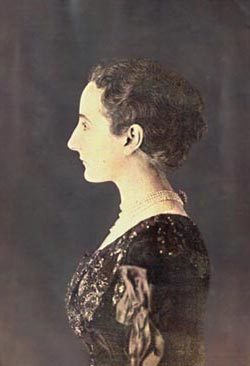
a photograph of Madame Gautreau, with the portraits made of her, one can certainly detect differences. 

There are many paintings of St. Kateri, but only one made by a contemporary, and that made between 2-10 years after her death. Could even someone with some skill in painting create an accurate description of a person years after seeing them? 

Despite the difficulty, there are a few things we know absolutely about St. Kateri. There are, additionally, many things we can deduce from a knowledge of the time period, and from the writings of her contemporaries. Two Jesuit priests, Claude Chauchetière and Pierre Cholenec were her biographers and are my primary sources for information on her life. Ultimately, I see this painting as a balancing act between the historical record, and--what we might term--the theological record. By that I mean the specific iconographic conventions of her depiction as well as the broader traditions of sacred art. What follows is brief discussion of the decisions I've made, in light of the research I've done, regarding her form an appearance. I'll write a separate post about the details of her dress

First and foremost, she is a Mohawk, but of Algonquin decent. I'm sure most of us have a mental image of a Native American, informed by Hollywood, Disney, etc. Many scholars have written about this aspect of visual culture, and it is a fascinating subject, but in summary, many of the depictions of Native Americans in cinema are heavily romanticized, containing anachronistic elements, and incorporating elements of traditional dress from multiple of tribes.

In the Jesuit records she is described as having weak eyesight. Cholonec and Chauchetiere differ in the severity of the ailment. Chauchetiere stresses that her bout with small pox nearly blinded her. Cholonec notes only that her eyesight necessitated a hood to shield her eyes in direct sunlight. It's surprising that two men, both knowledgeable about St. Kateri, could write so differently about this basic issue. Her name, Tekakwitha, can be understood as "she moves things aside." This may refer to her poor eyesight. Yet we also know, from the Jesuits and from the recollections of her companions, that she was a skilled craftswoman, especially with bead work. She was even employed to make wampum belts, one of the most important objects in the communal and diplomatic life of the tribe. These belts were beautifully and delicately embroidered. Her documented skill as a craftswoman leads me to conclude that her eyesight, while poor, could not have been very bad.

Based on these possibilities, I have painted her in a shaded woodland scene, and illuminated by soft, indirect light under the trees. In the paintings this is evidenced in the change of temperature between the background and middle ground (warm highlights, cool shadows) and the foreground (cool highlights: pinks, peaches, and light greys, and warm shadows: rich blues, oranges and warm greens) It is plausible therefore that she appear with her blanket about her shoulders, in traditional Mohawk fashion, rather than concealing her face, as she would have worn it under direct sunlight.

In the variety of paintings, drawings, and sculptures made of St. Kateri, only one have I found with pockmarks on her face. And the artist has done a great job of concealing them. Based on her interpersonal relationships recorded by the jesuits, her pock marks may not have diminished her innate beauty. When she lived along the Mohawk she had suitors, and while in Canada she was capable of instilling enough jealousy in other women to prompt an groundless accusation of adultery. From Claude Chauchetière biography we know that upon her death, St. Kateri's face changed. Her pock marks were removed, and her face was radiant. Because of this I've chosen not to paint her face with pockmarks, and in this, my painting is consistent with others. Indeed, even in Chauchetiere's own portrait of St. Kateri, she does not appear pockmarked. 

There is of course a convention of depicting saints with their corporal infirmities, but only where a postmortem appearance occurred in which they visibly retained those elements. Christ's scars are the most prevalent example of this. Others, such as St. Bartholomew--who was flayed--are depicted as in a "restored" body. Often St. Bart is depicted holding a limp suit of his skin, yet he is still painted with normal human skin, not as someone would actually look after having been flayed--with exposed viscera and musculature. I believe there's something to be said in favor of a body in glory. St. Kateri is not dead but is alive and with God. It has been my determination to balance her historical person (the mohawk physical features and traditional dress), with her present glory (removal of blemishes)

Saturday, September 21, 2013

Faith

© Julie Lonneman
St. Kateri has been a controversial figure in the centuries prior to her canonization. Indeed some of that controversy remains.  As is the case with many individuals who gave up the beliefs of their community to embrace the faith of others, there are conflicting thoughts about her among Native Americans. Devotion to St. Kateri has been strongest, not among the Haudenosaunee, but among the tribes and first nations of the western half of North America. It was among the plains tribes in the Dakota's and in Montana that an annual Tekakwitha Conference conference was established to strengthen and affirm the faith of Indigenous Catholics. The organizations name reflects the fact that it finds inspiration in the faith journey of St. Kateri

Certainly her faith is inspiring, but an aspect of St. Kateri's faith that I've not always know how to get my mind around has been her practice of mortification. We know through the Jesuit records that she and her companions frequently practiced often extreme forms of self chastisement and mortification. Indeed, the Jesuits themselves were shocked by the extent of their penitential practices, and tried to mollify their zeal with the introduction of more regulated European practices (see Allen Greer's Mohawk Saint: Catherine Tekakwitha and the Jesuits). Dr. Greer attempts to bridge the gap between the modern era at St. Kateri's time with an appeal to Nietzsche's conceptualization of christian asceticism. In summary, we in 21st century society are rarely made to suffer physically. We crave comfort and are disconnected from the corporeal realities that were so much a part of everyday life just a century ago. The ubiquity of bodily suffering in the past could precipitate an existential crisis if suffering could not be given meaning. Ascetic practices were one way that suffering could be given meaning and mastered. This observation makes a lot of sense to me. As a victim of epidemic disease, physical infirmity, warfare, and emigration, St. Kateri's adoption of ascetic practices may have been a way in which she gave meaning to this suffering.

A more compelling point of view, I think, I've found in Neal B. Keatings' Iroquois Art, Power, and History. I've been reading this book in tandem with a few others on the same subject, and my understanding of St. Kateri's ascetic practices has been heavily informed by information I've gleaned from authors discussing Haudenosaunee ritual, specifically the adoption ceremony that figures prominently in the initiation rites of the Mohawk community. The Iroquois viewed warfare as a way of expanding their community. The adoption ceremony often included torture, physical trial, and extreme physical endurance through which individuals were reborn into their adopted community. I don't think it's too far a stretch to say that St. Kateri could have understood mortification and penance in this light: as her initiation into her new faith. It is important to note however, that this initiation did not proceed upon a European, but rather a Mohawk path. She was making the catholic faith her own.

This, I think, is very significant. The traditions we've learned from a young age are very important, but ultimately we must all climb the mountain ourselves and make them our own. I like how Dylan Thomas expressed it in his poem No Man Believes.


Tuesday, September 17, 2013

The Landscape


Landscapes are something I enjoy painting a great deal. I like the way light and atmosphere interact. Especially here in Hudson valley. Since I move here, I've come to understand the quality of light that first moved painters like Cole and Church. My favorite, of the painters of the Northeast, is John Frederick Kensett. His Eaton's Neck, Long Island is one of his best. Seeing it today reminds of the first time I saw his work, in part one of the two volume Long Island Landscape Painting. I was amazed at his ability to turn such a boring scene into something so sensitive and immersive. It's quiet and unassuming, but as you can see from viewing it, his understanding of light is impressive. You can almost hear the soft flow of the tide and breathe the humidity in the air. A trip to the Metropolitan to view this painting--even if you saw nothing else in the museum--I think would be well worth the cost of the trip.

Understandably, St. Kateri is the subject of these paintings, but that doesn't mean I haven't enjoyed painting the natural environment that surrounds her, or that the environment can't be an important part of the composition. I have included many plants that are indigenous to the river valleys of upstate New York. Poplar trees, Cranberry and Northern Bayberry bushes, and a variety of the local lilies that grow in so many of wooded areas of the state. In the distance is visible a curve of the Mohawk river as it turns through Montgomery County. Here are a few details from the painting. It's coming along well and I look forward to showing it completed.


Tuesday, September 10, 2013

The End of Man


The title comes from a phrase in the Baltimore Catechism. I hope that I may be forgiven the use of non-gender neutral language. The phrase suggests something that is regurgitated in the art press every few years. People are always going on about whether or not painting may be dead since photography ended painting's monopoly on the narrative representation of the world. It's not something I'm particularly worried about, but I would like to speak to my motivations for persisting in the discipline of painting.

Even in the 21st Century, painting is still very vibrant and exciting. It stirs the imagination and the soul in a profound way. Oil paint in particular is, I think, a transubstantial substance. It is neither opaque, nor transparent; neither liquid, nor solid. It's soft translucency lends itself to the sculptural, and yet it is flat. Through it's veils a chromatic pentimento remains visible that recalls the barely apparent veins and fascia seen through flesh. Paint can be shaped and formed into an image, or manipulated with no referent other than its own color, volume, and texture. It exists on the palate in a neutral state, waiting to be formed, but it's color and physicality is suggestive of that transformation. Paint is actual and potential being. More to the point, it is both subject and substance. It is always both. Even on the canvas, after the painting is finished, it remains minerals and oil locked in a physical bond that oxygen will transform over days, years, and decades into a tight matrix. But it is also a person, a landscape, a still life. 

Moving in the other direction, even when it is on the palette, it is more than it seems. When it is an array of globs of ochre, cobalt, ferriammonium ferrocyanide, and cadmium, even as I pick up my brush and agitate it across the canvas, it is becoming something else. Ontologically, paint is difficult to pin down. I think that it is for this reason that painting will always draw it's adherents on. Certainly it is why I paint.

The images below speak to this point. They're all detail shots. There's little difference between a Pollock and a Rembrandt when you really get down to it. Both were smearing a splattering a viscous substance over a textured ground.


Neither are Anuskiewicz and Ghirlandaio very far apart in their technique. Notice the raking of the reds and greens, varied in density to create volume.


The best scholars and historians of art understand that paint is both subject and substance. Robert Hughes and James Elkins are a joy to read because of this. Laura Siedel and Erwin Panofsky actually have a lot in common in their readings of The Arnolfini Portrait. Both miss painting (the verb, not the noun). There's nothing more boring to read than an account of art that only accounts for the subject or its interpretation. As if the beauty of a Monet could be described in terms of haystacks and aquatic flora. There's much more to his paintings than that. It would be akin to saying religion consists solely of morality and rules for clean living. To say such things is to miss the deep needs and aspirations in which we all participate. That is to say, the end of man.


Friday, September 6, 2013

Corrections and Adjustments


There are many books about painting. Many of which have more or less specific directions which are not very useful. One can look to Cennino's Il Libro dell'Arte and find instructions regarding the painting of gangrenous flesh, or flesh pierced by a spear. Alternatively Doerner's The Materials of the Artist contains a description of Goya's method. Step 7 is "Easily and deftly draw the contours and refine them with loose reflected lights." That covers a lot of ground and, like Cennino's overly specific advice, doesn't help much.

Every painting reaches a point where there are no more steps. Ted Seth Jacobs, a draughtsman and Atelier instructor, has said that the greatest teacher is the blank page: every mark you make is right or we wrong based on its relationship to previous marks. It takes eyes to see, but it's all there on the canvas. In a sense the painting paints itself. 

So this is where I am. The grisaille has been painted, the coloring established, but from here on out it's me and the canvas, hand to hand. Each day I take stock of what I've painted the day before, and plan the day to come. I frequently have to adjust the drawing. By that I mean the placement of forms and the relationship of parts to the whole. In this you can see the lines I've drawn to modify her arms. I moved her shoulder down the other day, and if I don't adjust the position of her arms she'll look like gumby. Slowly it takes shape.

Tuesday, September 3, 2013

Blue

© Williamsburg Oil Colors

It's a favorite color. But their are so many varieties. When I was in high school I knew I needed a blue, red, and a yellow to paint. So I went out and bought some colors that looked interesting. I picked a cobalt blue hue (a mixture of ultramarine, phthalocyanine and white) and a naphthol red. I couldn't understand why my violets were muddy and flat. Fortunately since then I've figured out that red and blue don't make purple.

The optical properties of pigment necessitate that artists seeking to mimic the effects of light pick at least two of each primary, each tinted toward it's analogous hues. For instance, a purplish and a greenish blue would allow for a greater variety of mixtures than would a single primary blue.

The cost structure of blue paint has changed greatly over the years. For the medieval painter the best blues Ultramarine and Azurite were prohibitively expensive. Both are ground from semiprecious stones. The name of the former suggests it's origin: Ultra - Marine. Better yet, in French: Outre - Mer. Beyond the sea. The Frankish kingdom in Jerusalem. The spice trade brought this most exquisite of blues to Europe. It was the chemists Guimet and Gmelin who devised a means of synthesizing ultramarine from base materials. If ever there was an instance of an alchemical lead-into-gold procedure, this was one. The modern process brought ultramarine blue into reach for the common artist.

I'm using very little ultramarine these days. I primarily rely on Cerulean and Prussian blues. Cerulean is a stunning color. A weak tinter--especially the paint made by lower calibre color makers--but the only commonly available high key blue. Manganese was thought to be a good replacement, but it's toxicity has caused it to be rare these days.

Prussian Blue was invented by possibly the worst (or luckiest) alchemist in Berlin. Johann Jacob Diesbach was trying to synthesize a red pigment. But when a solution of ferric(iron)-chloride (red-orange in color) and a solution of potassium ferrocyanide (yellow-green in color) are mixed, the result is a bluish liquid, out of which will precipitate a blue pigment.