Friday, August 30, 2013

The Laying-In


The second half of my undergraduate education was spent studying with Jonathan Puls. I was at a small school, so he was the only show in town. He taught drawing, life drawing, painting, art history, and figure painting. Somehow he found time to paint as well. Among the many aspects of painting he taught me was that the painting only begins when the entire surface is covered. A painting is a lot to navigate, and it is important not to lose sight of the composition as a whole. So earlier this week, I pulled out my largest brushes and put as much color onto the canvas as I could. The paint is thin, so as to be ready to receive additional layers. The color is intense, to lend luminosity throughout the process. The bold colors are always exciting. As I began to paint I could feel myself jump a little, especially with the bright yellow. It's good for a person to be able to use such opulent and life-affirming paint.

Back to the painting. The laying-in, or dead-colouring, as Sir Joshua Reynolds termed it, is a very important stage of the painting. The idea is to say something about every area, from the darkest darks to the lightest lights. I need to know where the light will fall, where the shadows will lurk, and how the temperature will change through the composition. I've painted a number of smaller studies, so there aren't any real surprises for me here, although as I look at it completed, I've noticed a few adjustments in the body language I'd like to correct. You can see a bit of this in the photograph. She sees to be shrinking away due to the concave line of her form.

Tuesday, August 27, 2013

Grisaille


"Grisaille" is a fancy word for an underdrawing in monochrome. It is derived from the French "gris" and means "grey." It traditionally describes first step of the practice of the medieval and flemish masters, which involved creating an elaborate underdrawing, in a monochromatic higher key, which was then overpainted with glazes and scumbles of greater chroma and intensity. This unfinished painting of Christ and the Woman Taken in Adultery by Peter Bruegel the Elder is an example of the technique. As is often the case, necessity was the mother of this invention. The lack of intense opaque pigments meant that artists desirous of bright coloring, must take advantage of the optical properties of transparent pigments to achieve their goal.

As artistic practice evolved and more opaque colors were introduced this function of the grisaille changed as well. Baroque painters like Velazquez and Titian employed orange and red ground for the purpose of modeling flesh by varying the opacity of their lights and darks. The effect of the red ground is masterfully employed in Velazquez's Vulcan's Forge, where many of the warm notes in the flesh are nothing more than the ground showing through his brushwork. His contemporaries would see his work and exclaim: "It is made of nothing... but there it is!"

My use of a grisaille will be similar to this last example. Most of the painting will be opaque, but especially in the flesh, this underlying warmth will give the painting more vigor. I use raw umber to draw out the composition, and to model the values in the shadows. As cool color, the umber allows me to develop the temperature relationships in the flesh and establish the greys, greens, and blues that often show up in shadows on the human form.

Friday, August 23, 2013

Materials


I get to play with a lot of fun toys. It is a matter of personal pride and good craftsmanship that artists have often sought to make beautiful paintings with beautiful materials. The finest, and most expensive materials have traditionally been reserved for the most important subjects. The blue of the Madonna's robe is one such example. Few artists today use gold leaf and genuine lapis-- $170 for 5 grams.  

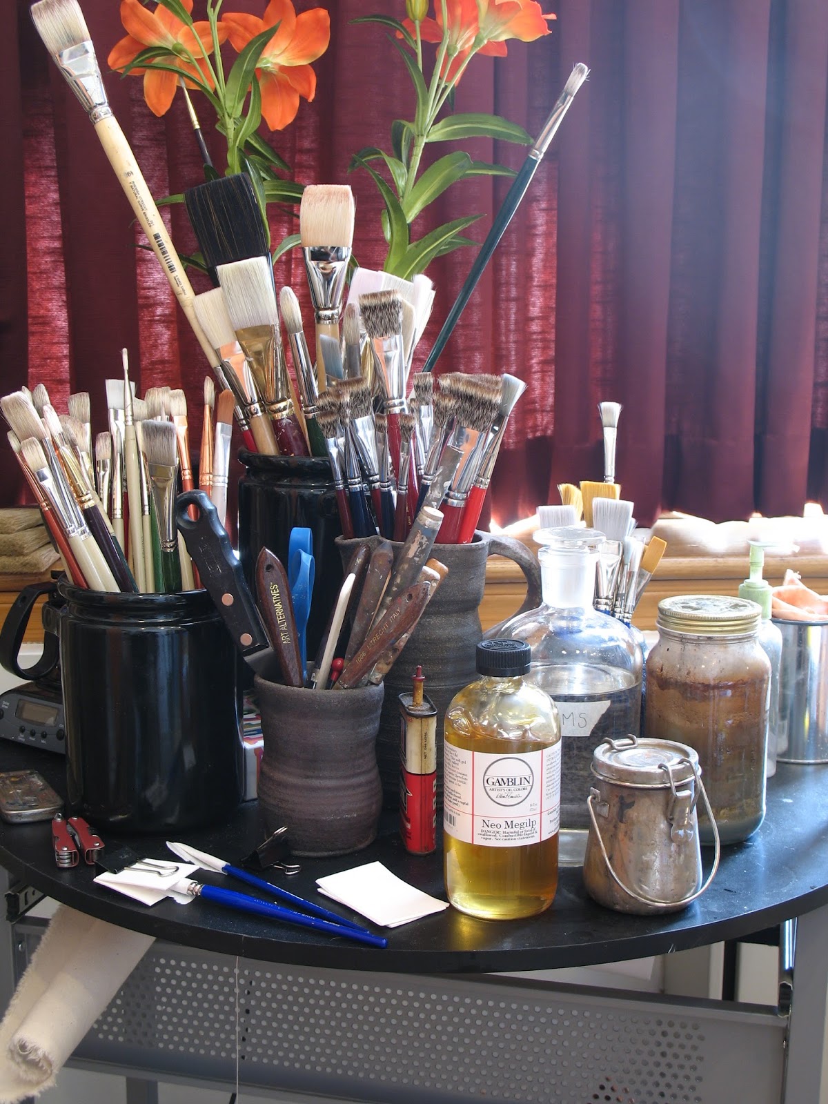
I know I probably get more excited about these sorts of things than most. Consider that I wrote three posts about preparing a surface upon which to paint. For those who are interested, a word about what I'm using to make the painting.

Some artists are very mysterious about their materials, as if a neophyte bought a jar of the right stuff she might but the master out of business. It's ridiculous that the any substance, like a philosopher's stone, could transform a mediocre painting into something great. I suppose that the difficulty of painting, its slow learning curve, and the transubstantial beauty of the great works of art do provoke such speculation.

I use very little besides oil paint and mineral spirits. When painting into wet paint I like to use Gamblin's Neo Megilp. Sometimes I make my own medium with stand oil and mineral spirits. There's nothing special about my mediums. Grumbacher, Winsor & Newton, and probably every other company makes something similar. I like Gamblin because they make high quality products which are as non-toxic and environmentally friendly as possible. Rather than send the pigment dust from their air filters to a landfill, they make paint from it, and hold a competition. Come by my classroom on September 27th to participate. Materials provided.


I use Williamsburg paint. It's made in the US. It used to be made by hand by Carl Plansky. Now they're a Golden brand, but are still made in small batches according to Carl's recipes. It's the best paint. The Cadillac of paint. I don't tolerate differences of opinion on this subject. I will concede that Old Holland and a few others might be as good. Winsor and Newton I have a soft spot for, as a watercolorist. But I've used a lot of paint, and nothing compares to Williamsburg Cadmiums. Their Cerulean is like the singing of the angels. Of their Viridian, Guignet would be proud. Even their Yellow Ochre is spectacular. To use other paints after using these is depressing. Concern for my students finances compels me to include a less expensive paint in their supply kits, but do try to make a good case for buying the best.

Regarding brushes, the bigger the better, says Da Vinci. The best brushes are made in Germany, of the hair of the finest Chongqing hogs. Don't worry: they're being slaughtered for their pork. So painters need not worry that animals are being harmed. It's good to make use of the whole animal. The Czech Republic used to raise some pretty good hogs, but no more. With brushes, brands don't matter. If a company is buying high quality materials, they're not going to spoil them with shoddy craftsmanship. If it says Chongqing bristle, you're getting the good stuff. I also like sable brushes and lettering brushes for more delicate work. Dick Blick makes a scholastic "one stroke" and Utrecht a Sablette, both of which I use a lot. They're so cheap you can just throw them out rather than clean them if you like. 

Monday, August 19, 2013

Head Studies


Sargent is reputed to have said that "a portrait is a painting with something wrong with the mouth." I used to think that he meant that is it hard to paint a face. After having painted a head or two I understand that there is something about a face that is unique, but that there is a lot more that we all share in common. If a painter captures the former, without the later, the viewer thinks the face looks wrong, regardless how successful a likeness has been created. Think about it: have you ever had a photograph taken of yourself and thought "I don't really look like that, do I?" The truth is that you don't and that a photograph isn't you, simply because an image frozen in time has little relationship with a dynamic reality. It is the portrait painters job to understand the anatomical, emotional, muscular, and chromatic components that constitute a person's visage, to orchestrate the unity of those elements, and to communicate that unity through paint.

In order to begin making a portrait it is essential to understand the human form, especially it's more complicated components, such as the head. It's very common for painters to make multiple studies of the subject's head either from life or from photographs. Returning to Sargent, a great many studies for his audacious portrait of Virginie Gautreau (Madam X) are visible in Volume VI of his Complete Paintings. Many of the studies are most understandable a rehearsals of the brushwork.

Below you'll see in process photographs of the second study I've painted of Lauren's head. Compared to the first I'm getting a much better understanding of the architecture of her form. The modulation of warm and cool tones I'm starting to explore in greater depth. I painting pretty fast, and working on these as I finalize my preparations for the real painting. I'm happy with the color and modeling in this sketch.

In-process photographs are visible below


Thursday, August 15, 2013

Model

Modeling is kind of like acting I think. It requires an awareness of ones body and a kinetic memory. It's great to work with someone who who understands this. If I try too hard to cajole and prod a person into the right pose the results are rarely any good. Those wooden artist manikins come to mind. Everyone has them, but does anyone use them?

I've been fortunate to have found a great model for this project. Lauren has agreed to work with me over the next 6 - 9 months on an ad hoc basis for the portraits. So.. without further ado, I'd like you all to meet Lauren:

© Katria Foster Photography
Lauren is a native New Yorker and resides on Long Island with her parents. She has just returned from a semester abroad in New Zealand, where she spent time exploring Australia and Fiji. She is very excited to begin her senior year at Siena College, where she is studying Business Management. She plans on working in the Entertainment and Event Planning Industry when she graduates. Lauren has been a member of the Siena Dance Team for the past three years and was elected Vice President of Finance of her dorm during her junior year.  She is an accomplished pianist, an avid reader, and enjoys riding her motorcycle. She also enjoys health and wellness, the beach, cooking, and spending time with her family. Lauren is of Italian and Cherokee descent. She is honored to be a part of this project and to be a part of the visual representation of St. Kateri

.