Thursday, October 31, 2013

Composing a Painting


© David Hockney

I had a question from a student about how I put this painting together, whether I had worked from a photograph, or from life. The answer is somewhere in between, and needs some framework to be fully understood.

Making a painting entirely from life was rare until the 19th century. Scholars believe that the incised marks that litter Caravaggio's canvasses as evidence that he departed from the usual conventions and worked from life. It was the pride of French realists such as Gericault or Corbet, that they often worked from life. The Impressionist Monet practically turned this into an obsession, switching canvases every fifteen minutes to remain faithful to changes in light. More recently Antonio Garcia Lopez has worked this way on his massive landscape paintings of Madrid. He typically works a few minutes a day for years on a single painting. There is a simplicity and directness about working from life. Some, such as John Ruskin, have attached a moral virtue to working from life. Yet often the scale, complexity, or even the weather preclude working from life. In such circumstances artists have turned to reference material in one form or another to guide their practice.

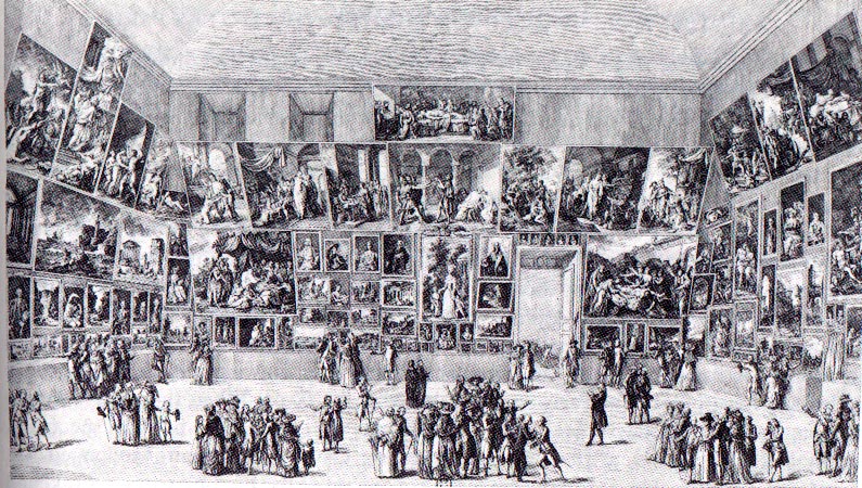
Being a recent invention, photography only became an important tool for painters in the past 150 years. Thomas Eakins worked out compositions and refined his drawing with reference to photographs. Prior to this, painters learned to work from their drawings. Sketches served as references. The trois crayons technique was uniquely suited for preserving value and temperature information from which a painter could develop a composition. Similar, artists would refer to the works of their colleagues in the form of drawing or paintings. When the original works were not accessible, prints would serve. One of the primary motives behind the formation of the European academy was to afford students access to visual libraries or the work of the Masters. Curators are fond of pointing out the borrowing of visual tropes on the didactics that line museum walls. Consider the similarities of Noah and Manoah in two these paintings by Natoire and Murat. Kehinde Wiley is a contemporary artist known for his appropriation of art history, as in this piece, which hangs in the Brooklyn Museum.

From the Renaissance to the Modern era, history painting, such as exemplified in the work Laurence Alma Tadema, or Charles Le Brun, occupied the highest position within the discipline of painting--as opposed to genre, still-life, landscape, or portraiture--because of the skill required to compose such a work. They required erudition, as well as the technical skill to orchestrate multiple studies into a single cohesive whole. The best painters in this vein cultivated a certain showmanship and sense for drama. They needed to be able to cut to the quick of a narrative and capture subtleties of emotion and body language. I would consider them more akin to film makers today. A good history painting tells a story in a single moment, but it wasn't possible to paint one in a single sitting, or even from a single reference. Artist brought in models, made sketches, and united these into a single image, much like David Hockney creates a single image from multiple photographs above.

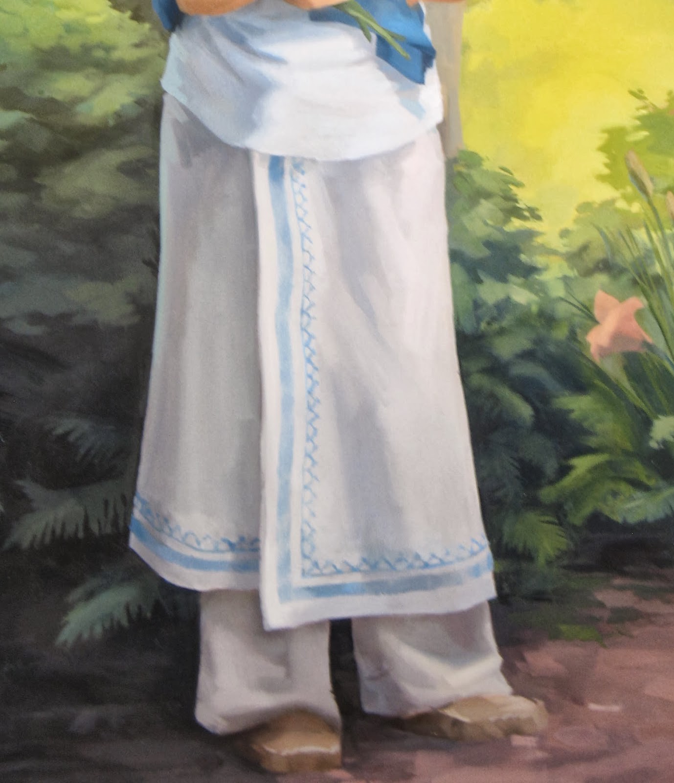
I completed St. Kateri in God's Creation using such a methodology. I had the benefit of a model, and took a couple gigabytes worth of photographs. I worked from three distinct images to create her body--one for general body language, a second for the head, and a third for the lower limbs. I made use of additional sittings for the hands and eyes with a second model. The landscape came from sketches and photographs made in the Mohawk Valley and on campus at Siena. The ferns grow in a park near the river, but the lilies are located outside of the Sarazen Student Center. Through a careful study of light and color these disparate elements are united into a single, unified whole.

Thursday, October 24, 2013

Unveiling Part 2

© Sergio Sericolo
I was excited to see more coverage of the unveiling on Siena College's homepage yesterday morning. The article is available via this link.

An except from my speech from Monday evening follows:

"St. Kateri Tekakwitha was a new subject for me. I primarily paint landscapes. As I read about her, her personality was quickly apparent. Despite her small stature and poor health, she was not a weak person. The Jesuits at Kahnewake saw a need to moderate her zeal. She made her own plans for a convent and made her own profession of faith and vow of chastity. She possessed a confidence that is natural to those know who they are. Psychologists call it self-actualization. I would call it fullness, or integrity. To be whole.

I’ve been thinking about what that means. I’d like to share something that I’ve read recently and that I’m still trying to get my mind around. It repeated many times, in many different ways in the writings of Richard Rohr, of whom I am a big fan. He’s a Franciscan, as are quite a few at Siena College where I serve on the faculty. He has a lot to say on the subject of saints and our relationship to them. I’d like to paraphrase from his writings.

St. Paul, in his first letter to the Corinthians, urges his readers to “Imitate me, as I imitate Christ.” Saints, like Paul and Kateri Tekakwhitha, are not saints and worthy of imitation because they are bigger, or stronger, or more productive. They are saints because they are who God made them to be. It’s not something extra that makes them holy. They ARE.

That is a challenge and a comfort. A challenge because we are so easily blinded and distracted from the truth, but a comfort because God has already accomplished it. God has already made us to be who we are, we just have to live it. This is something I’ve reflected on as I’ve been painting. In light of that, who was she, and who is she? It is the possibility of capturing this sort of ephemerality in paint that has compelled the work of painters through the ages. That’s why this project has been so much fun, and so challenging.

It has been written by her biographers that, to those who knew her, St. Kateri made tangible the grace and beauty of God. She was who God made her to be. Completely and wholly. What does that look like? This painting is my answer to the question."

Tuesday, October 22, 2013

Unveiled


Last night I had a great time at the St. Kateri Tekakwitha Parish during the public unveiling of the new portrait. I've had a great time making it, and it looks beautiful in the church. With this post, the painting is also unveiled on the web. The photograph comes from the McGreevy Prolab & Propress in Albany. It's a top notch photo, but no photograph can really do justice the a real painting. I'd encourage anyone viewing this on the web to consider a trip to the church at 2216 Rosa Road to see the painting. It will be hung on Thursday and blessed during an upcoming mass.


I'll have some video and news paper photo's up here as well as the week goes on. Let's start with these, from the Schenectady Daily Gazette, and short video from the Parish's facebook page.

Tuesday, October 15, 2013

Framing


Well, there it is. It's finished and in its frame. It looks great. Next week, the curtain comes off at 7pm at 2216 Rosa Road in Schenectady.

No one ever buys a painting because of its frame--except perhaps Rowan Atkinson--but a bad frame can really turn people off. Good framing is an art in itself, so I was happy to take the painting to the Clement Gallery in Troy and rely on their expertise.

Today framing happens after a painting has been completed, but this hasn't always been the case, and indeed is only possible when convention dictates a simple frame. When frames were more ornate, artists such as Millet, or even Van Gogh, preferred to put this finishing touches on their paintings after framing "I can only finish in a frame," Vincent wrote to his brother Theo. Gold has always been a popular choice for picture framing, either imitated or with the application of leaf. A beautiful painting was a treasure, and a gold frame drew attention to that fact. The purpose of leaf has always been to imitate solid gold. So modern frames that leave the edges of the leafing visible, reflect our preference for the appearance of age, whereas in centuries past it would have meant shoddy workmanship.

Today smaller frames are popular, but that has a lot to do with the convention of hanging a single work on the wall with plenty of breathing room. The "white cube" of Brian O'Doherty being the dominant aesthetic for the past 40 years. Within the last decade, this preference for extreme neutrality surrounding the artwork has meant that artists often frame their work in white frames. This would have been unheard of a generation ago, but now you can't swing a dead cat in Manhattan or Brooklyn without hitting contemporary art in a white frame. During the 18th and 19 centuries it was rare for a single work to be given such primacy on the wall. It would be an understatement to call the exhibitions cluttered. Artists fought for attention by building larger and more elaborate frames--it was the only way you could ensure space between the spot where your painting ended, and another bagan. To have one's work alone on a wall was a rarity, and artists took advantage of such occasions as they presented themselves. While he probably thought of the painting as one component of a beautifully crafted room, the egotistical painter in me likes to believe that Whistler designed an entire room as a "frame" for one of his paintings.

While the fashion of framing has changed over time, but they essentially serve the dual purpose of protecting the edges of the artwork and, in absorbing the weight of the painting itself. Of course, that is the bare minimum a frame can accomplish. I think that a frame should call the work out from the wall and subtly compliment it's coloring, without looking "matchy." It should have an elegant and understated formality or professionalism, much like a classically cut suit, or Chanelle's timeless little-black-dress. For the painting St. Kateri Tekakwitha in God's Creation, the committee and I picked out an elegant wood frame that brings out the natural luminosity of the painting, and will mesh well with the environment of the church.

Thursday, October 10, 2013

Unveiling October 21, 7pm, 2216 Rosa Road

© Charles Wilson Peale
Not so long ago the studio arts dominated the visual culture of world. Images had to be handmade, and reproductions of those images, in the form of etchings, engravings, and lithographs were also handmade. Up until the 19th century, to see a color image that was not a painting would have been practically impossible. Paintings rested at the pinnacle of images and incited both admiration and hostility. Sargent's portraits were frequently caricatured in Punch magazine and Harper's Bazaar. At the Art Institute of Chicago, in 1913, response to the New York Armory Show was so hostile that Henri Matisse was put on mock-trial and burned in effigy.

On the more positive side, and as the visitors to Olana are told, crowds waited in long lines for the unveiling of Frederic Edwin Church's latest landscapes in the later half of the 19th century. The Civil War was over, and the nation needed new narratives and mythologies about their relationship to the New World. They found it in the pristine, edenic paintings of the Hudson River School painters. These monumental canvases showed the sublime western landscape unstained by violence and ideology. North and South could be united in their subjugation the West. At the forefront of the movement was Church, who travelled who toured the east packing theaters and exhibition halls with eager audiences. He was kind of like Elvis. Young women swooning as he tore the curtain off his latest masterpiece. Young men practicing their brushwork and glazing, dreaming of galleries and museums. Parents disapproving of the "new art" of landscape painting. Give me a Charles Wilson Peale any day over this garbage they would say. (Or for the radically conservative--Sir Benjamin West).

All this is to say that the painting, St. Kateri Tekakwitha in God's Creation, will be unveiled on October 21st, at 7:00pm in the church at 2216 Rosa Road.  Hope to see you all there.

Friday, October 4, 2013

17th Century Mohawk Dress

I am indebted to the Arthur C. Parker photo archive at the New York State Museum for much of the material I have used to make this painting. I am especially grateful for the assistance of Dr. Betty Duggan, Curator of Ethnography, which out which I would have been groping blindly in the dark.


Traditional Mohawk dress consisted of 5 primary elements. The blanket, the over-blouse, the skirt, The leggings, and the moccasins. We know very little about their dress before European contact, but from the writings of Hudson, Champlain, Smith, etc. a rudimentary picture can be formed. By St. Kateri's time, the Haudenosaunee were trading the the French, Dutch, and English, so European cloth had replaced whatever fabric or hides they had previously used. Especially in Canada, the trade allowed for access to European made garments, as well as fabric. But as in many things, the Native Americans absorbed and made things their own through alteration and embellishment. St. Kateri herself was held in high regard for her skill in these crafts.

Once European contact had been made, images of the Haudenosaunee began to appear. I've previously commented on Verelst's court paintings. Other images circulated more widely, such as J. Laroque's etchings and Scotin's engravings. Most of these are considered heavily romanticized, and while predicated on some historical fact, they are indebted more to Dryden and Ashley-Cooper's concept of the Natural State than they are to a cultural understanding of the Iroquois.

Two images, and one object have been most useful to me in clothing St. Kateri. Unfortunately I don't have permission to reproduce them here, but all three are found in the catalog of the Auf den Spurer der Irokesen exhibition in Bonn and Berlin. The first is a doll from the collection of the National Maritime Museum in London. While it postdates St. Kateri by a century, it was made in the Canadian Mohawk community she called home. My second source are watercolors of Iroquois made by Millicent Mary Chaplin in the early 1800s in the collections of the Library and Archives of Canada, Quebec. The third are the drawings and lithographs of the clothing made by Carolyn Parker and her family, widely considered the foremost authorities on traditional Mohawk dress. By identifying the period embellishments and materials (industrial era steel needle embroidery vs. pre-industrial quill embroidery; linen and hemp fabric vs. cotton and silk) I believe it is possible to turn back the clock on the clothing and arrive at an approximation of the dress of a typical 17th century Iroquois woman.


Her blanket I have painted in a brilliant indigo, reflecting the dye most likely employed by the Mohawk. It brighter than what we would normally see in blue jeans because the fabric of the blanket was a white trade cloth that St. Kateri would have dyed herself.  She wears it about her shoulders, as was the custom of the Mohawk, and was likely her preference in the shaded setting in which she appears.

Her blouse fits loosely, due to her petite frame, and is made of a coarse European fabric that she or her family had tailored. Many variations on the blouse exist and are recorded in drawings and etchings. Heavier blouses that covered the arms were typically worn in winter. They went sleeveless or topless in the summer, using the blanket when needed. Some beading was typical, but from the Jesuits we know that St. Kateri eschewed much of the ornamentation favored by young Mohawk women, so I have painted her blouse simply and unadorned as an undyed garment.

Her skirt is made from a heavy fabric that was wrapped around the waist. It may have been secured by a belt or cord.  Bead-work typically followed the edges of the garment. I've created a design based on patterns recorded by Arthur C. Parker, historian and ethnologist, and of the Seneca himself. The color of the pattern is indicative of the pale blue shellfish of which the beads were made from.  The pattern represents the dome-of-the-skies topped by the world tree. My bibliography contains a number of books that treat the subject of Iroquois arts and symbols in greater detail than I can here.

Many varieties of leggings seem to have been worn, some more elaborate, and others less so. I have chosen a simple loose fitting garment that would have served her well during the daily routine of the average Mohawk woman. They are simple and utilitarian, much like her moccasins. Of these, most were likely to have been made of animal hide. Moccasins consisted of a top flap and thicker bottom sole. The sole would have been wrapped up to cup the foot and sewn with sinew. More delicate and decorous moccasins may have been worn for social and ceremonial purposes, but these suit the simplicity of the rest of her garb.

© Arthur C Parker, from Certain Iroquois Tree Myths and Symbols