Tuesday, January 28, 2014

Scumbling


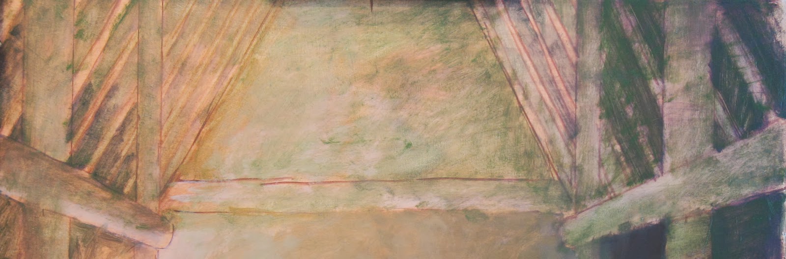
When I made the last painting, I had a brilliantly colored natural landscape with which I could fill the composition. With this painting, I have a relatively monochromatic interior space. The beams and and architecture add some interest to it, but if I just paint it brown and call it good, I think I'll be in trouble. Instead, I plan to do quite a bit more layering to create background space that is more dynamic. In the image above oranges, greens, and violets are visible. I'm borrowing a technique from my thesis professor at Utah State University, Christopher T. Terry. Professor Terry paints still life and interiors that many would consider empty compositions. Visually, his paintings are resplendent with color, but in an understated way. Certainly they're not gaudy or flashy in the way that many self-consciously colorful paintings can be. In his paintings, an ochre wall reveals itself to be layer upon layer of ceruleans, violets, and oranges. It is a technique that rewards contemplation and close inspection.

A word that painters use to describe such a process is Scumbling. Very similar to glazing, scumbling refers to the broken application of an opaque color. It's a technique I teach at the tail end of my Painting I class at Siena College. Below is an example of student work from this class.


Wednesday, January 22, 2014

Kahnawake Furniture


One challenge I ran into between finalizing the sketches and setting up the models has had to do with proportions. When I make sketches I can pose the human body in whatever way I want, but real human beings don't work that way. Comfort and usage result in narrower ranges of motion. When it came time to pose my models I realized that if I wanted St. Kateri and the girl in the planned arrangement, then St. Kateri's legs would need to bend in some miraculous ways, or the girl would need to be much younger. The solution I settled on was to have St. Kateri sitting on something.

This, of course, resulted in another problem: upon what does she sit? Or, more to the point, upon what would a woman living in a late 17th century Canadian mission village sit? That called for more research. I initially thought I'd find something with three legs: it seemed simpler and much easier for the carpenter to level. So I was very surprised that the vast majority I looked at were four legged. I don't think I found a single three legged stool from earlier than the 18th century. That's not to say they weren't made. It could be the case that they just haven't survived to make it into museum collections. Maybe they were so common that no one preserved them, or so poorly made that they well apart. But rather than take a risk by trying to paint something I haven't seen, I kept looking for something from the right location and dated to the right time period.

I found something plausible to paint in the collection of the Musee de la Civilization in Quebec City. The stool in question came from a farm in the Quebec Province, and has been dated to early 1700's . It's simplicity and functional appearance make it an excellent fit. It is plausible that the residents of Kahnawake could have made this stool, or traded for it. The image above comes from the museum's online archive.

Wednesday, January 15, 2014

Linear Perspective and the Underpainting


When I made the initial sketches for this paintings, I eyeballed the interior. It worked out well for a small scale painting, but when I transposed it onto the larger canvas, it was apparent that I'd need to be more exact, in the interior is to look like believable space. This painting has taken far longer to lay out than this first. Some people really enjoy thinking about angles, numbers and ratios, but I'm not one of them. Paolo Uccello would spurn his wife to work on perspective drawings. So I got out my ruler, T-square, and protractor to make the space work. In the photograph above you can see some of this work. Since the pencil lines don't show up very well I've drawn over the more important elements with oil.

I've based the space on the size of the figures. Though seated here, St. Kateri would stand 6.5 heads tall, befitting her diminutive stature. The girl stands 5 heads, and the boy 4. The vanishing point occurs at the top of St. Kateri's forehead; the beams of the roof radiate outward from here. The angle of the floor and benches however, radiate from a second vanishing point near St. Kateri's neck. This second vanishing point in necessary to prevent the "wide angle" lens effect that results from the vanishing point being located high in the composition, and the location of the figures in the foreground.

The posts of the structure are very useful for maintaining a consistent recession of the roof slats. Essentially I have two calibration points with which I can measure from for the roof slats. Not all of these measurements and details will be evident in the finished painting. It helps me to paint with confidence, knowing the structure that undergirds my marks is geometrically stable. The watercolor below by Sargent is very expressive, yet the painting sits atop a very precise and calculated drawing. The detailed perspective drawing is most visible in the steps and columns of the buildings.


For anyone interested in the contemporary and classical uses of linear perspective drawing, a great place to start reading is Deborah Rockman's Drawing Essentials

Thursday, January 2, 2014

Art Books

commons.wikipedia.org
While visiting family in Idaho over Christmas, my uncle Roland mentioned to me that he had some art books he wanted to get out of boxes and back into the classroom. He said, about the art classes he teaches (and has taught for as along as I can remember): "We're no longer a research institution." Siena has a good library, and through Connect NY we have access to the libraries of 17 other schools, but some books are just better to have on hand in the classroom. The Idahoan in me prefers to have squirreled away a stash of books off-grid.

I'm pretty excited about the books. Some of them I remember leafing through when I was a student in Roland's classes. Charles le Clair's The Art of Watercolor, Andrew Loomis's Drawing the Heads and Hands, and two catalogs of the paintings of Frank Frazetta and W. R. Leigh. Loomis' books in particular were very important to me in learning to draw the human body. Loomis presents the subject as a process of simplification and abstraction that is refined with observation. It is a very straight forward way to draw the body, but as with any abstract concept, has to be played around with and thoroughly internalized before it can be put into practice. I struggled with it for a while. It wasn't until I had learned a alternative method based on sighting and measurement, that Loomis's method really clicked. His process is essentially the way I draw today, and is the way I've conceived and drafted both paintings of St. Kateri Tekakwitha.

I'm very grateful to Roland Giampaoli for sharing these books with me and I look forward to using them in the classroom. They're instructive, but they're also inspiring to the imagination. They're better to have in the classroom than buried in a library. I just need to find a bookcase with glass doors so I can make them available in my classroom, without leaving them out in the open.